Constellate 2016 @ The Spice Factory

12472810_1027902357248945_7446676043838043971_n

This Friday (March 11th) the Spice Factory is hosting Constellate Exhibition 2016.

Constellate features distinctive works by McMaster’s Studio Arts third and fourth year students. More than just painting, the exhibit includes sculpture, print, drawing, and digital work.

Artists at Constellate 2016 include: Kristina Durka, Parker Flood, Stephanie Grant, Rachel Hillock, Meaghan McMurrich, Jonathan Mitchell, Hilary Rosa, Hannah Sampson, Maria Simmons, Jasmyne Smith, Brittany Sostar, Jennifer Tewnion, Riley Vanderzee, Tess Visser, and Cassandra Whall.

There will also be performances by Thomas St. Clair, Timid the Brave, and Jeremy Sklad.

The Spice Factory is located at 121 Hughson Street North and doors open at 7:30PM.

For more details and photos visit: https://www.facebook.com/constellate2016 or @constellate2016 on Instagram


Advertisement

Leave a comment

Filed under Uncategorized

Architectural Spotlight: The Waterdown Library and Flamborough Seniors Recreation Centre

IMG_2754

RDH Architects
163 Dundas St E, Waterdown
Completed: January 2016

Designed by RDH Architects the 23,500 square foot building is more than just a library. It also houses the city’s municipal service centre, a senior centre, Flamborough information and city services, and the Flamborough archives.

The 15,000 square foot library has better accessibility, more computers, outdoor reading areas, and even dedicated quiet spaces, to name a few of the upgrades. A huge step-up from the town’s last library, which occupied the old East Flamborough Town Hall and had limited space to meet the current standards of today’s libraries. It was too small, hidden, and dated for a town with an ever-expanding population.

IMG_2735

Topography played a pivotal roll in the design and programming of the new building. Situated on a sloping site, the building splits levels while managing to stay a single storey, in keeping with the character of the community it surrounds. The grade is used to create identifiable spaces through a sloping corridor, acting as the buildings axis. The spaces are also organized through levels, creating an easier navigation of site and accessibility for all ages.

IMG_2671

Inside the library, the children’s section includes unique furniture, and a playful asymmetrical skylight. Surrounded by glass exterior walls, it provides transparency for parents and an engaging environment for the children.

IMG_2732

IMG_2698

IMG_2704

Stairs and ramps lead you through the tiers of categorized book stacks. Skylights bounce off the punched ceilings, pouring natural light throughout the interior. And quiet studies encased in glass offer solitude from the surroundings, while still keeping the user connected to the space through visibility.

IMG_2681

IMG_2687

At the top tier of the library the glass glazing overlooks Dundas Street, scattering southern light amongst casual seating, a communal table, and computer desks. The use of natural and artificial light is impressionable.

The material palette inside the library is simple: wood (some of it repurposed), polished concrete floors, gypsum board, steel, and glass. Rich but subdued, a recipe for a warm and welcoming interior.

IMG_2762

Outside, the glass curtain walls on the north and south sides of the building interact well with the street and the neighbourhood it surrounds. The use of the sites grade and the division of space is apparent at the south end of the building. You can see the levels split, divided by a grassy knoll and stairs with a glass balustrade. Limestone panels clad the west side of the building, meeting the southern façade with a geometrical cantilever, creating a significant punch to the overall composition.

At first glance the location seems wrong. It’s located on Dundas Street, the town’s busiest arterial road, close to big box stores and highways. But that’s exactly the point. Waterdown is sprawling and relocating it to another downtown side street doesn’t make sense. Parking is scarce and accessibility becomes an issue. The site it resides on engages onlookers with its presence and the northern entrance is also connected to the approximate neighbourhoods through the use sidewalks and bicycle parking racks. It’s a new hub for a town with ever-expanding subdivisions. Modern orthodox planning reigns supreme.

The new Waterdown Public Library and Flamborough Seniors Recreation Centre has already won a Canadian Architect National Award of Excellence and it’s easy to see why. This project is one of the best pieces of architecture the city of Hamilton has seen in years.

1 Comment

Filed under Architecture

Architectural Spotlight: 7-11 Brock St

Inspired by Quentin Tarantino’s film “The Reservoir Dogs,” this adaptive re-use project in a 100 year-old masonry warehouse will be the latest addition to the North End. Designed by Thier+Curran Architects, each townhouse is designed with its own unique characteristics.

Screen shot 2016-01-29 at 12.30.15 PM

The ultra-modern exteriors will include brick, custom steel, corrugated metal, glass and glass block, but each design will be different. For example, townhouse number 7 will have a two-storey periscope with skylights for additional natural lighting, number 9 will have an entrance foyer tower punctuating the roofline, and number 11 includes a two-storey loft.

Glass block, used for privacy, is just one accent to the southern facades. Custom doors painted different colours (Mr. Orange, Mr. Pink, and Mr. Brown) will have full length stainless steel pulls and a custom artistic finish by local artist David Hind. Townhouse number 11 also includes a large commercial style glass garage to the entrance porch, screened with a wood slatwall for additional privacy.

Screen shot 2016-01-29 at 12.32.01 PM.png

The interiors will be bright and spacious. Reclaimed brick and 14-to-17 foot timber fir ceilings provide the space with a warming, open feel. There will be cork tiling in the kitchen and bathrooms. Bamboo floors will be in the living/dining/sleeping areas and limestone in the foyers. The townhouses also include fireplaces and skylit gallery spaces with wall space for art. Number 11 will have an open ramped gallery to the basement, complete with a skylight.

Townhouse number 7 and number 9 is one bedroom plus den, while number 11 will have two bedrooms. Number 11 also includes surface parking, a basement with safes (one converted into a wine cellar), and an outdoor shower. Each townhouse also has its own private garden.

Each townhouse differs in size:

No. 7: 1,337 sq.ft.
No. 9: 1,416 sq.ft.
No. 11: 1,771 sq.ft with 3,440 sq. ft. private side/rear garden and 1,035 sq.ft unfinished basement

Screen shot 2016-01-29 at 12.30.34 PM

This 100 year-old warehouse was once a machine shop, holding US patents from 1888 until 1905. During the prohibition it was a liquor warehouse (Number 11 has a barrel ramp to the basement and two brick walk-in safes). And in the 1970s, the building was a boiler room.

The project is slated to be complete by spring 2016.

4 Comments

Filed under Architecture

Photo Tour: The Tivoli Theatre

IMG_2597_FotorIMG_2603_FotorIMG_2604_FotorIMG_2582_FotorIMG_2589_FotorIMG_2585_FotorIMG_2608_Fotor

2 Comments

January 13, 2016 · 7:45 pm

The Curious Case of The Hamilton City Centre

IMG_2522.JPG

The City Centre, formally the Eaton Centre, is an eye sore. There is no subtle way to put it. It’s ugly, it’s imposing and for such a young building, it’s aged terribly. However, there’s more to this postmodern monstrosity than what meets the eye. It’s become a part of the James Street North fabric and is worth examining more critically.

Completed in 1990 by Baltimore firm RTKL Architects, it was designed during a time when postmodernism was avant-garde in Canada. Mississauga’s City Hall was completed a mere three years earlier by architects Jones and Kirkland and for the most part, was a resounding success in a booming city. But one of the issues with postmodern architecture is it becomes dated. Quickly.

Though what’s interesting about architecture is how style is cyclical. What was once in style becomes out of style, only to be back in style again. Postmodernism has a charming braveness to it. It’s daring, confusing, whimsical, unique, and sometimes terribly executed (sorry, Michael Graves). Most buildings designed during this era of architecture look like they’ve had an identity crisis. Is it modern? Is it contemporary? Is it classical? The City Centre is no different. What is it?

IMG_2511

Reticles of steel tracery surround the James St N entrance, an unintentional metaphor for how it missed the mark.

The exterior is more like a barracks than a mall and could be mistaken for the James Street North Armories. It’s a fortress, with almost no windows, unwelcoming entrances, and kitsch accents. The brickwork, tacky but fun; the steel framing, odd; the pastel colours, dated; and the clock tower is one of its only applaudable statements. Overall, the exterior could do with some re-imagining.

IMG_2534

New glazing added to the York Boulevard facade

In 2008 Lintack Architects did some exterior and interior work, adding windows and offices along the York Boulevard streetwall. A continuation should be made to James Street North. More windows, entrances that reach further to the street, and a greater connectivity to storefronts at street level could help revitalize its appearance. There is no interplay between the City Centre and any of its neighbours. Finding ways to mirror the success of pedestrian friendly buildings is a step in the right direction.

IMG_2517

The inside of the City Centre is a different story. It’s a lovely example of postmodern design done right. With nods to an architectural past (the interior was inspired by the Galleria Vittorio Emanuele II), the space is light, airy, and is a welcomed change compared to the abysmal, low-ceilinged bunker that is its neighbour, Jackson Square.

IMG_2513

Skylights pour natural light into the space through rows of arches. Detailed columns line the balustrades on multiple levels, framing the space in a gentle manner. While the food court is below grade in an atrium setting, topped with a glass dome surrounded by a frieze titled “Lineage” by artists Susan Schelle and Mark Gomes. The interior brings back nostalgic feelings to many Hamiltonians and it ought to be preserved accordingly.

This is where the fear of change lies. The interior doesn’t need much. What it needs is refurbishing. The incandescent bulbs are burnt out like an old amusement ride, paint is peeling and fading into unrecognizable colours, and the space is sorely missing tenants.

Drawing tenants should be the main concern, which will come. After all, this playful space once housed Eaton’s. World Gym is soon to move in, which should bring a great amount of foot traffic and hopefully snowball into something more.

The food court needs food, the spaces require tenants, and the tiled floors need treads walking all over them. As Jackson Square slowly claws its way back to a viable shopping destination, so too will City Centre. All it needs is some love and attention.

Let’s just hope Cash 4 Money leaves the premises, because the City Centre is better than that. Nothing deters people like a shark in the water.


5 Comments

Filed under Architecture

Tour: Theatre Lofts

image6

It was a cold, rainy winter day as I entered 189 King Street East through the alleyway. I ascended a narrow corridor of stairs to the top floor and entered a loft that looked like something out of Brooklyn. Greeting me was the smiling face of Peter DeSotto. DeSotto and his partners, Alvaro Valencia and Marvin Grimm, of Urban Map Inc. are in the middle of repurposing the former Sandbar Tavern and I was about to take a tour.

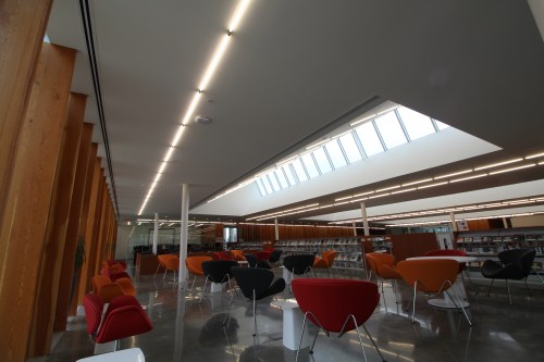
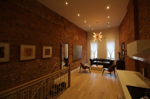
It’s no longer going to be called the Sandbar, though. It’s now Theatre Lofts. And the loft I just entered, next door, is their current office. An open concept space, with an eclectic array of furniture, sleek kitchen, and even a clawfoot tub. After a quick glance of the space, I quickly grasped their vision: open concept, high ceilings, exposed brick. The new recipe for Hamilton’s evolving aesthetic.

IMG_2468.JPG

We sat down to talk about the project. I found a seat on a midcentury Wings chair, with DeSotto directly across from me on a beautiful tufted brown leather sofa.

DeSotto is a violinist tenor and founder of the famed Quartetto Gelato who recently moved to Hamilton, but you would never know. His love for this city is palpable. Accompanying us were the realtors for this project, Jess Fabrizio and Vince Lazaruk. They were as interested in learning more about this space as I was.

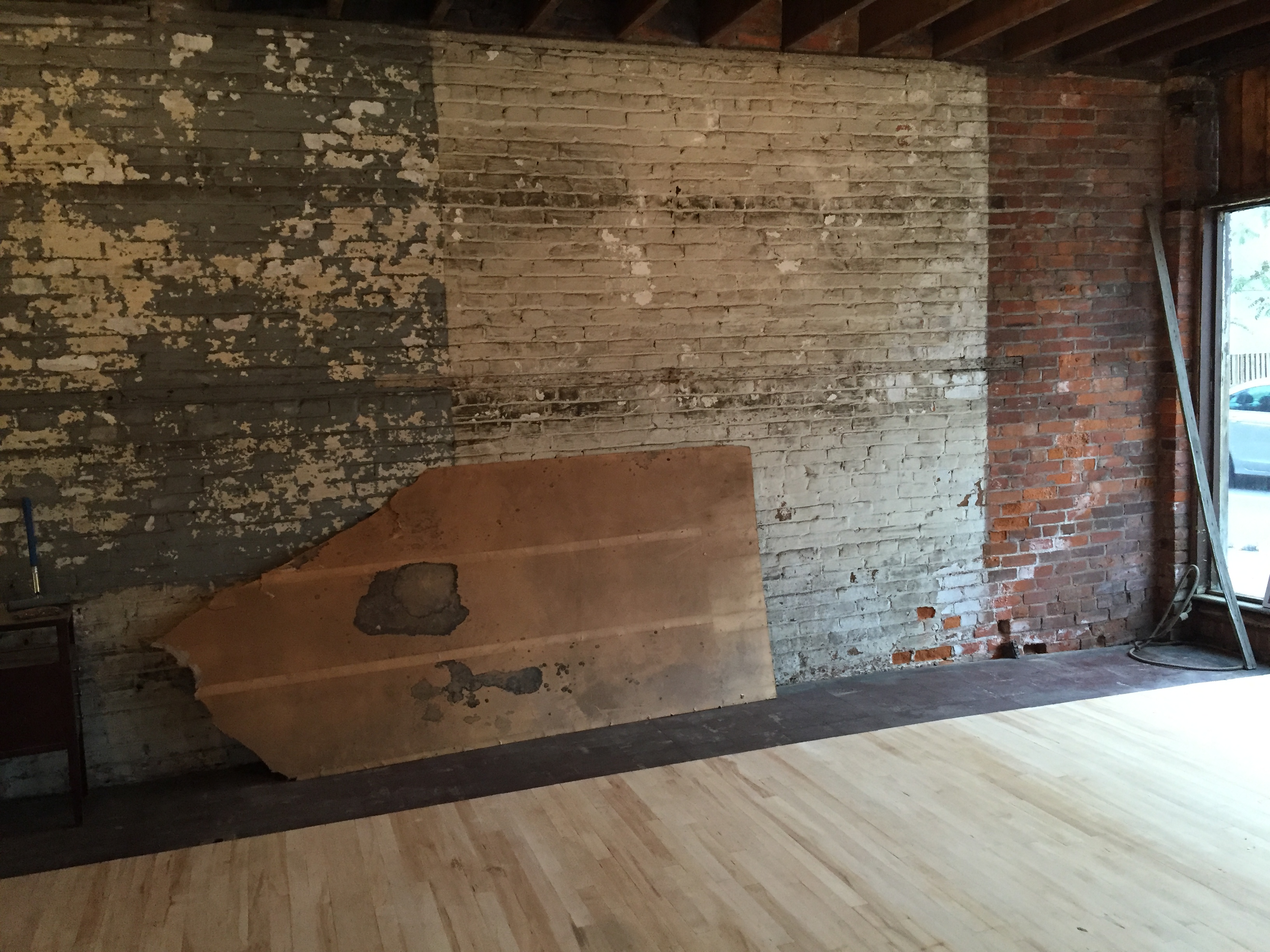
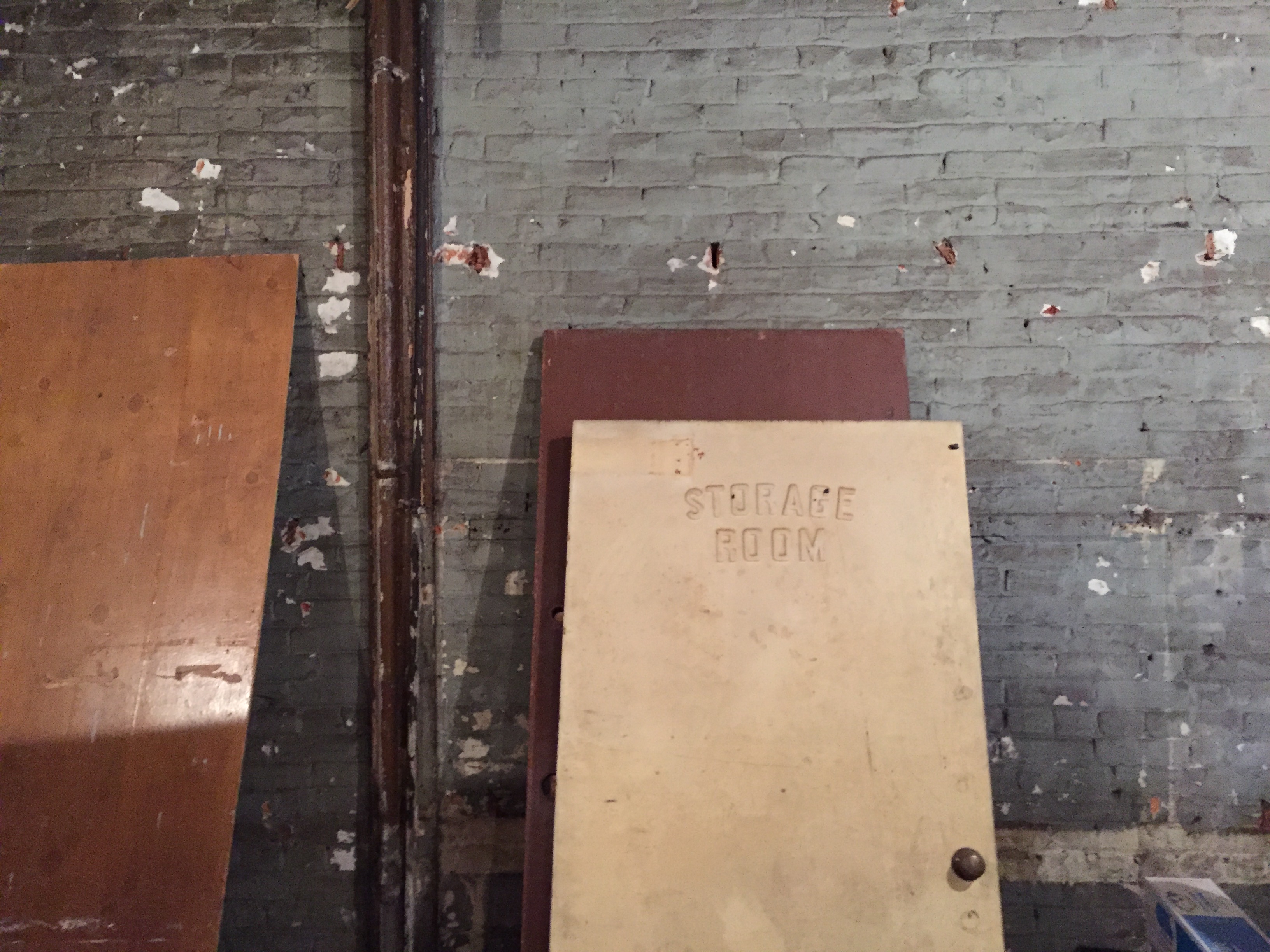
The first thing DeSotto told me is how “toxic” the building was when they first started doing work. Moldy and dusty, they had to wear a breathing apparatus when stepping inside.

“It was a dark place. There was ‘Death’ written on the walls (and) blood on the walls,” he said.

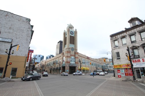
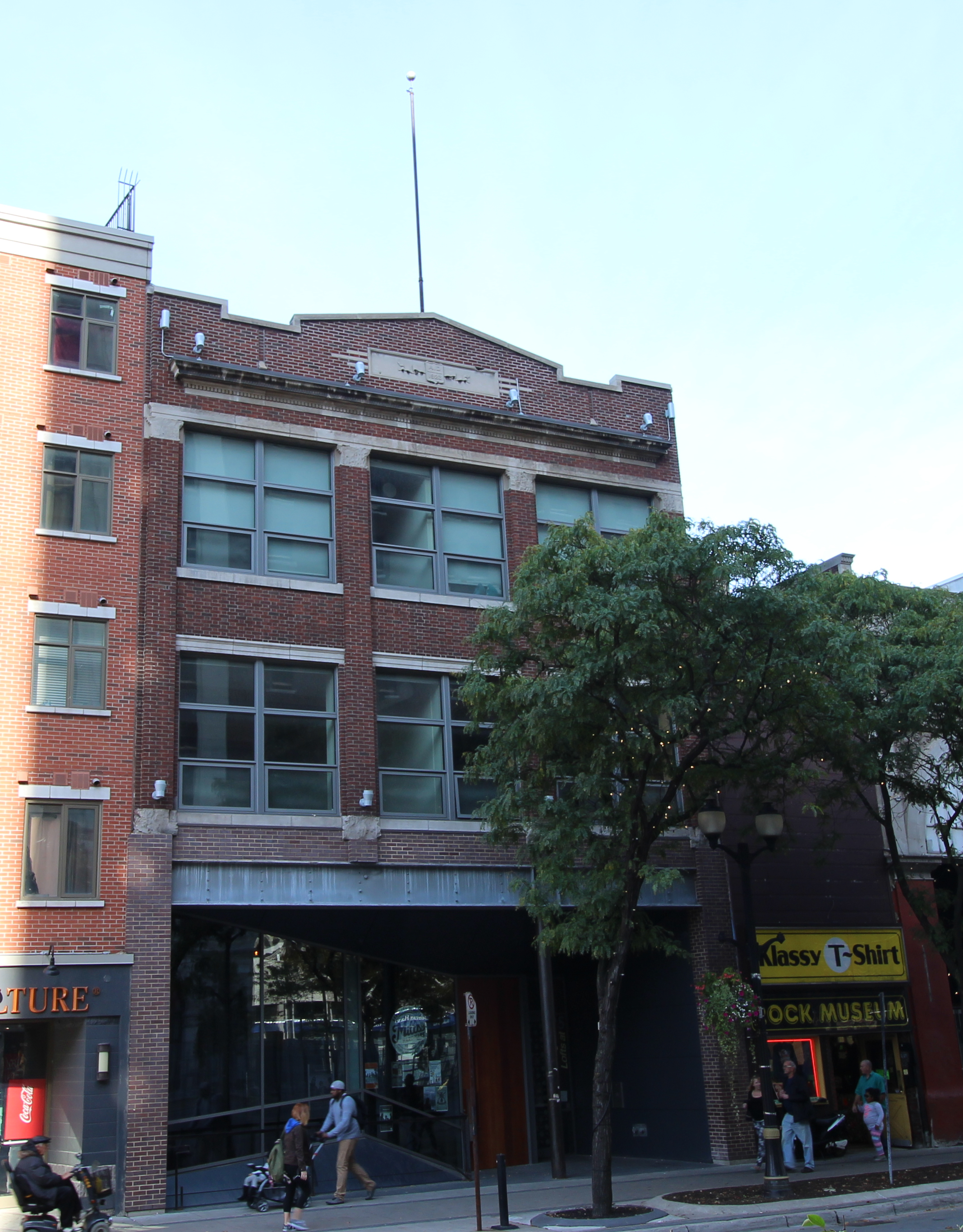
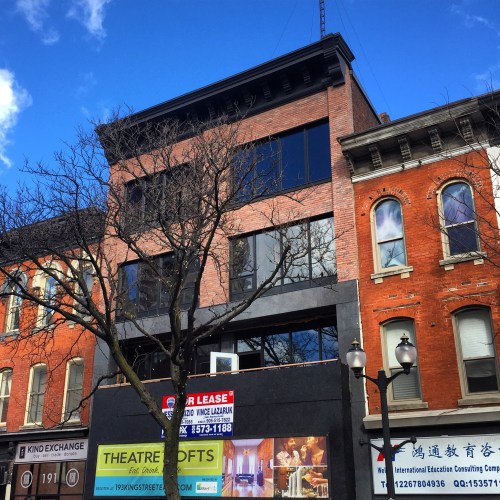
Death would be the perfect word to describe the Sandbar Tavern, a building decaying for years on a street that is rapidly revitalizing. But the International Village is alive and this adaptive re-use project is both literally and figuratively theatre for the street, with a marvelous new façade rambunctiously acting its way into the spotlight as what will surely be one of Hamilton’s hottest addresses.

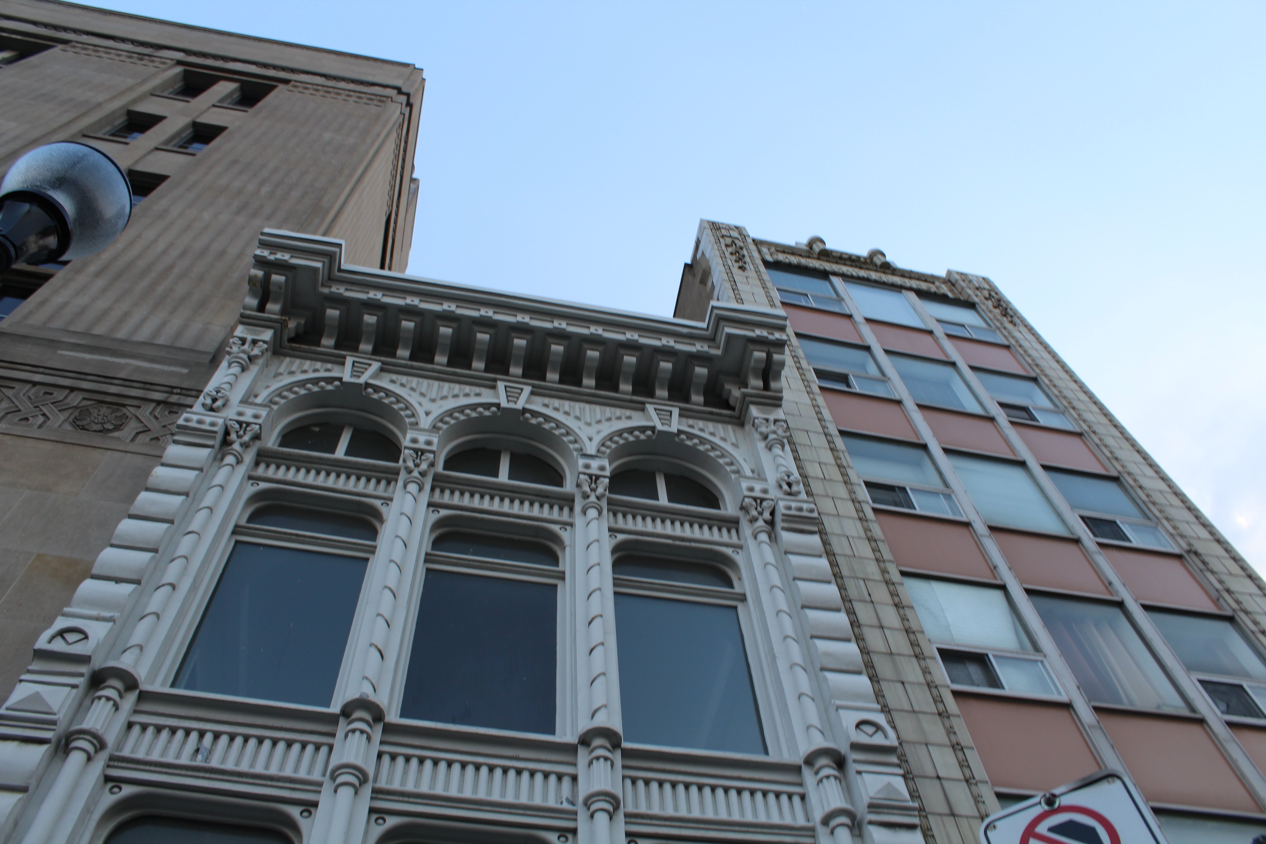
The King Street façade features restored brick, new fenestration, a jet-black cornice, a balcony on the second floor, and an accordion style glass front at street level, mirroring the two row buildings sandwiching it and creating continuity. If this were a stage set for the theatre, it’s been painted well.

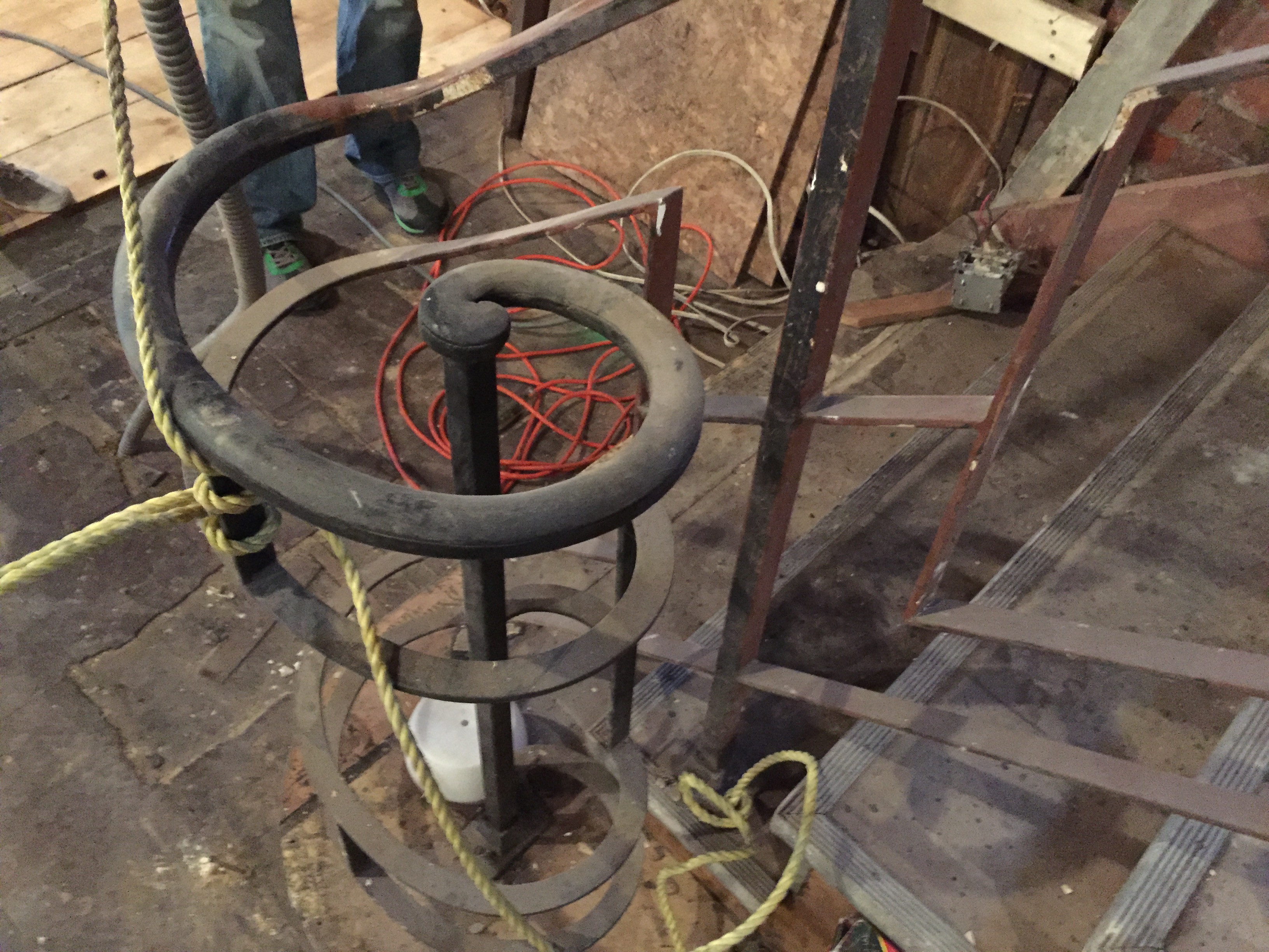
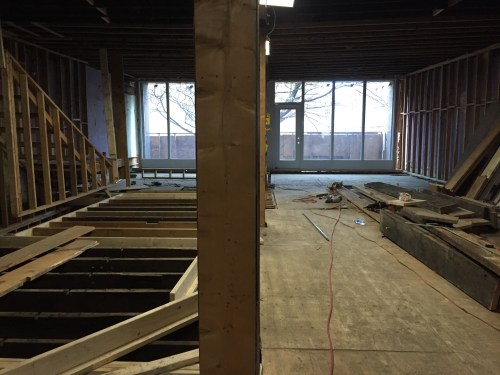
Next we went for a tour of the space. Hard hats, muddy shoes, and makeshift stairs; DeSotto was not only the tour guide, but also the safety officer.

“We’ve been extracting two garbage bins of drywall and plaster per day, for months now,” he says as we lean over a wood safety balustrade to look at the excavation happening below.

image1

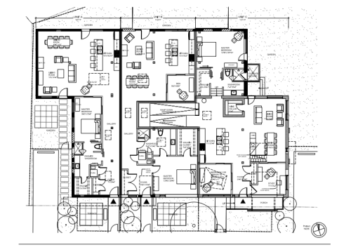
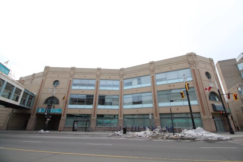
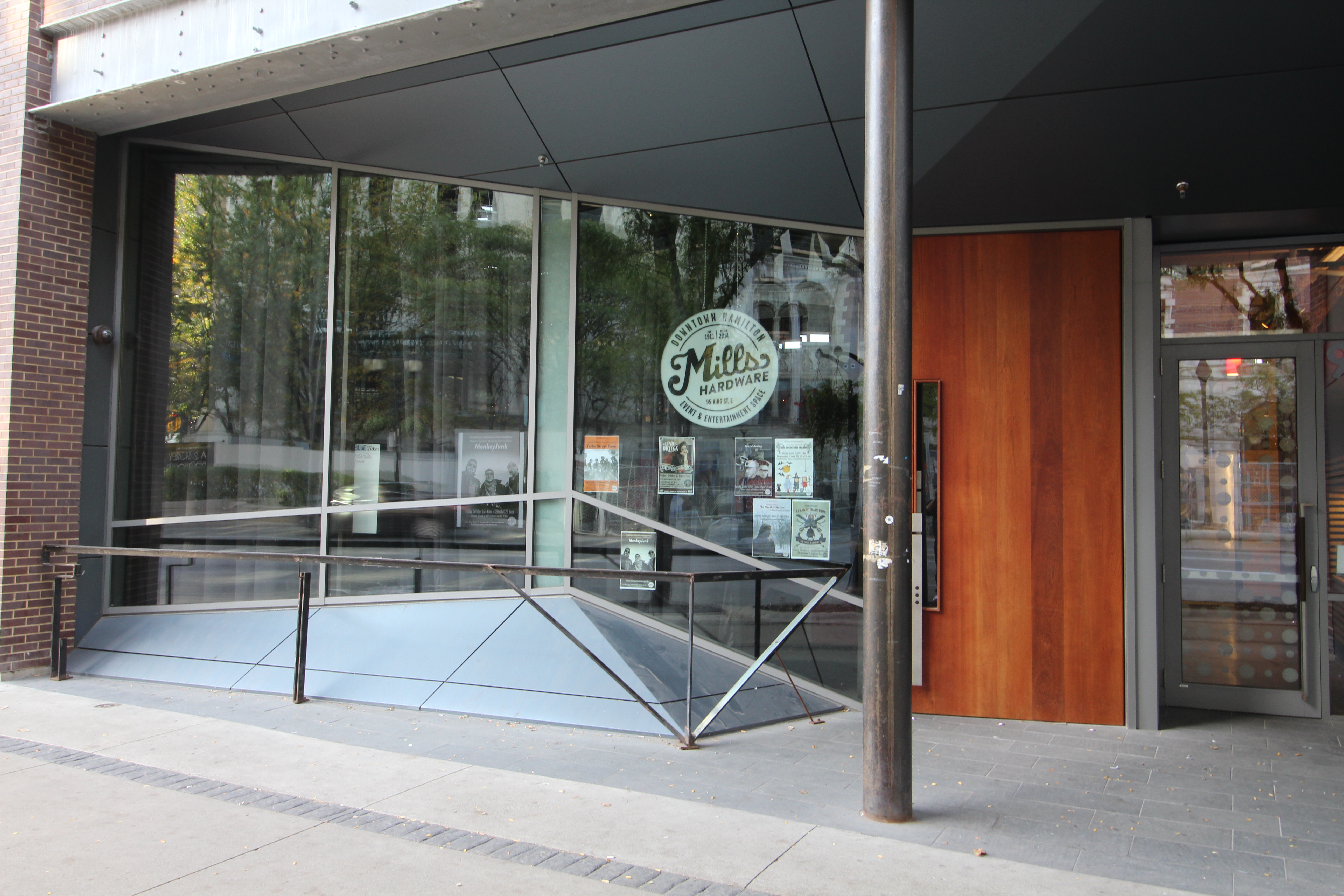
At street level the new three thousand square foot space will host a restaurant (The Hamilton Culinary Institute, probably).

image2.jpeg

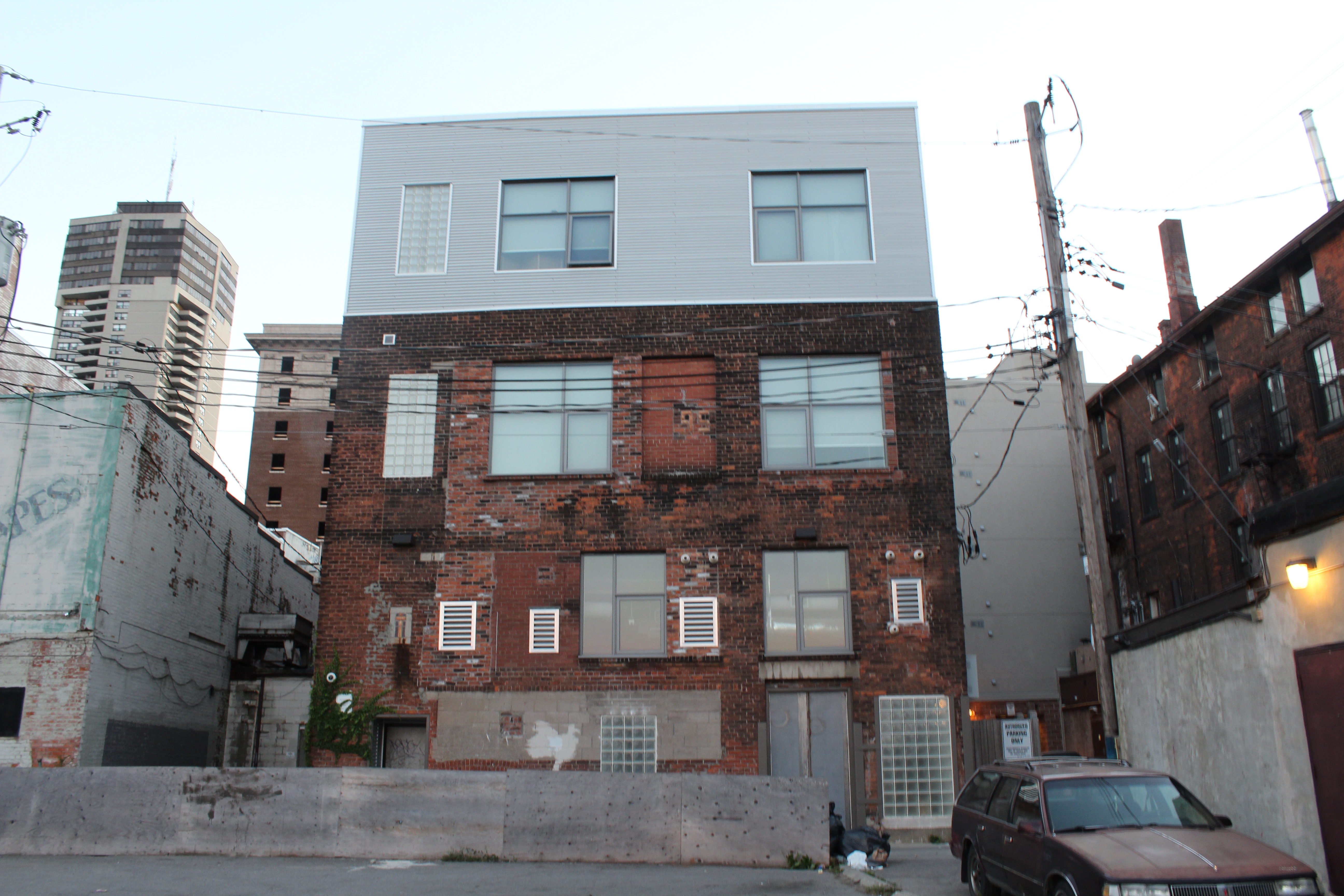
The second and third floor is going to be eleven lofts in total. Exposed brick, unique accents, plenty of windows, and even a balcony are just some of the features for the residents on the second floor. Weaving in and out of wall studs, DeSotto paints a picture of what the finished project will look like. It’s easy to envision when you’re on a tour with someone so enthusiastic about a space.

IMG_2480.JPG

image5

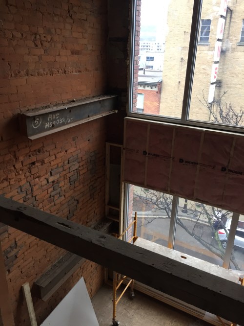
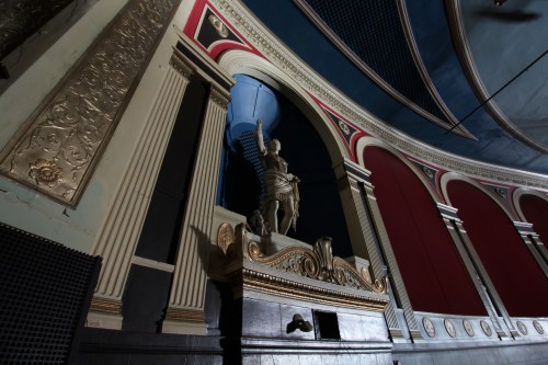
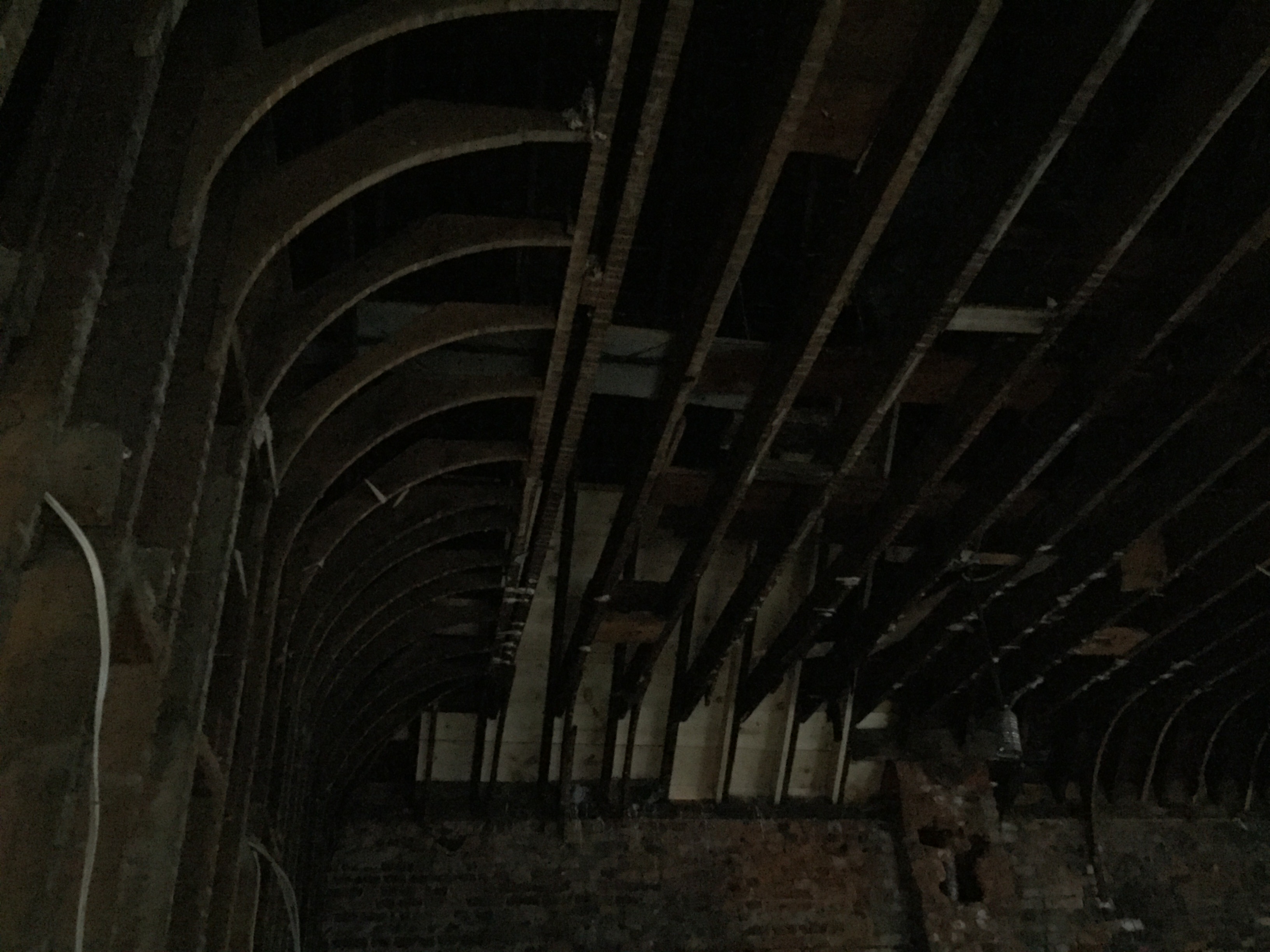
Just getting to the third floor took the balance of a gymnast, but was well worth it. 24-foot ceilings with two levels, glass block windows, I-beams from original signage, exposed columns and ductwork. These spaces will be a harmonious mixture of new and old.

What was a somber day turned into a hopeful day. A building is getting a new life in a tasteful manner. The International Village will get yet another diamond. It’s starting to run out of rough.

I would refer to Peter DeSotto as Shakespeare, and these lofts as Urban Maps Theatre, but the play they’ve written for this building is anything but a tragedy.

Theatre Lofts are slated to be complete by April 2016.

1 Comment

Filed under Uncategorized

A Special Event: Hamilton Flea at Brown’s Tire – November 14th

fleaold

Hamilton Flea is back and in a new location. Last time was Treble Hall and this time around it’s the old Brown’s Tire Building.

flefle

The old Brown’s Tire is located at the corner of Wellington and King William in a turn-of-the-century, three-storey brick building. Covered with event signage by The Story Girl and Circa Projects, the building is full of nostalgic features that are fitting for a pop-up flea.

IMG_2405

The exterior of the building, facing Wellington, has three floor-to-ceiling windows at ground level, decorative keystones above the upper storey windows, and an intact cornice complete with corbels. The storefront fascia is exposed, waiting for tenants to occupy the space and erect new signage.

image1

image2

Inside it is magic. Original hardwood floors, layers of peeling paint over exposed brick, white classical columns, and large beams highlight the first floor. The stairs leading to the second floor are of an early modern design, with a mild steel trapezoidal balustrade and swirling banister.

image5

As you reach the second floor you see more of the same: exposed brick, wood floors, a row of columns, a black and white beam, and exposed joists. Numerous windows illuminate the room in a glowing harmony, shining poetic beams of light on a space yearning for more.

image7 image8

The third floor is the real deal. A must see space. The ceilings are high, with subtle vaulting. All the joists, strapping, and cross bridging is open. Look through it all and you’ll see a peaked ceiling high above. There are levels to this floor, through a chorus of wall studs, worthy of investigating. The potential for the future of its space is palpable.

image4 image6

Much has been found during restoration. Old signs, doors, unique solid blocking, receipts, and other little elements have appeared, showing the rich history of this old commercial building. Hamilton Flea is the newest notch on the building’s old leather belt.

The notches are many. Some of the business that have occupied the building include:

  • Farr and McManus Furniture Finishes (1925)
  • Bamford Tire Service
  • Classic Athletic Club
  • Wellington Tire Service
  • Brown’s Tire (1942)
  • HCA Vacuum

Hamilton Flea, presented by Girl on the Wing and The Academy of All Things Awesome, is an event worth applauding. Not only does it bring together local and regional vendors, it also showcases unique historical buildings looking for investment and love. Shortly after they hosted the flea at Treble Hall, the building was sold to developers wanting to do more with the vacant heritage space. Hopefully the owners of the Brown’s Tire Building find the tenants they are searching for and then some. Saturday November 14th can’t come fast enough.

fleaposterfinal

2 Comments

Filed under Entertainment

PEDrides Spotlight: Mills Hardware

mills

Mills Hardware is an adaptive-reuse project that was completed by Thier + Curran Architects in 2013 at a cost of nearly four million dollars. Dating back to 1909, the building went through a lot of changes. From hardware store, to strip club, to now arts centre.

It boasts a multi-purpose gallery, event space, eight artist studios, a meeting room, and twelve loft apartments.

IMG_5893

The building has seen much transformation inside. Before work was done, the second floor was replaced by a mezzanine and has since been removed for a two-storey ground floor. The event space is 1800 square feet and is multi-purpose. A portal like metal threshold complete with railings and slat benches, crafted in a raw, industrious manner, extends across the room and separates the event space from the entrance. The space also includes a bar to the east side. Walls are exposed, pipes are showing, and the character of the building can be read in its walls.

Behind the event space are four, two storey studios. The studios include celestial lighting and metal doors displaying inspirational quotes from famous artists. The size of the studios ranges from 400-500 square feet.

IMG_1587

The exterior is a complimentary mixture of old and new. The original masonry at the front of the building was restored, with new large picture windows installed. At street level, the curtain wall is angular and inverted from the street. It draws the passerby in and invokes curiosity. Metal panels playfully angle down from the glass and into the ground, and a large pivoting Brazilian wood door welcomes guests into the event space.

Above the ground floor are twelve artist’s lofts ranging from 500-to-700 square feet. The apartments are equipped with light parquet wood floors, wood trim, and stylish kitchen spaces. Some of the units include exposed walls and wood ceilings with original steel columns and beams. The common areas carry the motifs that exist throughout the building, like super graphics, bright colours, industrial lighting, and exposed brick. Another unique feature of the old building is a mailbox and bulletin board installed into a display wall that surrounds an old safe.

IMG_1502

The rear of the building includes more restored brick, a corrugated steel clad third floor, and glass block windows. Stylish, preserved, and re-used, Mills Hardware is a catalyst for adaptive re-use in the core and has become an anchor of inspiration and place making on King Street.

1 Comment

Filed under Uncategorized

#PEDRides

image1

On Sunday I had the opportunity to lead a PedRides bicycle tour on contemporary architecture in the core. The focus of my tour was on adaptive-reuse and restoration, as well as new builds.

I started the tour with a quote from one of the great architectural theorists, Rem Koolhaas. He said, “Preservation is overtaking us.” His theory is as the year’s progress, preservation is becoming more prevalent. It’s being approached proactively instead of retroactively and contemporary architecture plays an important role in regards to a buildings future form and function.

The route was very ad-hoc and the buildings I discussed varied. I didn’t cover everything I wanted because I was under the weather and new to giving tours. When it comes to tours, I’m generally more comfortable in a double-decker bus listening to some overly enthusiastic guide rattle off the same information all day to a bunch of snap-happy tourists.

The ride was fun, the people were great, and it was in the city I love. What more could you ask for? I would gladly do it again.

I will be posting articles about each building in the same order as the tour (except for Witton Lofts, as I’ve already written about it). First up is Mills Hardware. Stay tuned!

Leave a comment

Filed under Uncategorized

Heritage Spotlight: Victoria Hall

image1

Victoria Hall
William Stewart/Tran Dieu Associates
66 King St E
Completed: 1888/2008

It’s enamel white; it’s delightfully detailed; it’s in Gore Park, and it’s a National Historic Site. It’s the Victoria Hall building designed by Hamilton architect William Stewart.

IMG_0558

Completed in 1888 for Hamilton Lawyer Alexander Bruce, this three-and-a-half storey building sits wedged between the large Dominion Bank Building and the six-storey terracotta A.B. MacKay building.

The façade is composed of galvanized sheet metal, giving the appearance of a rich painted stone texture, but without the expense. The sheet metal is sculpted by hand in Italianate detail.

IMG_0556

Above the storefront, three-bay windows are surrounded by elongated columns spiraling towards the sky with decorative corbels clinging at the pointed tops as if they were the wings of a butterfly. Flanked by marshmallow-like rusticated pilasters, the high relief details draw the eyes up in a true tripartite fashion.

IMG_0551

The top half-story has short arched windows complimented with ball shaped voussoirs and large keystones. Capping the building is a large overhanging cornice shaped with bulbous corbel brackets and a simple frieze.

Victoria hall was designated as a National Historic Site in 1995 for a number of reasons. It’s a rare High Victorian commercial building amongst the rest of Gore Park’s building stock and Victoria Hall is also one of the earliest remaining sheet metal facades still intact to grace the skies of Canada.

The building was purchased in 2005 and the Toronto engineering firm of Tran Dieu & Associates converted the upper stories into two large residential units. Both units were occupied after the renovations, which were completed in late 2008.

Leave a comment

Filed under Architecture