Tag Archives: photography

A SoBi tour with Bill Curran

IMG_4105.JPG

Bill Curran pointing to the landscape beyond as he discusses the surrounding neighbourhood

Architect Bill Curran and I have been planning a bike ride for some time.

We often tour around Hamilton, checking out buildings and houses, discussing architecture, the neighbourhoods, and Hamilton’s deep history. Because of how large Hamilton is geographically, we either pick a neighbourhood to walk or we end up taking a car to cover the most ground possible. This weekend we were finally able to go for a bike ride. The area we picked is one of Bill’s favourites: the industrial north.

IMG_4082.JPG

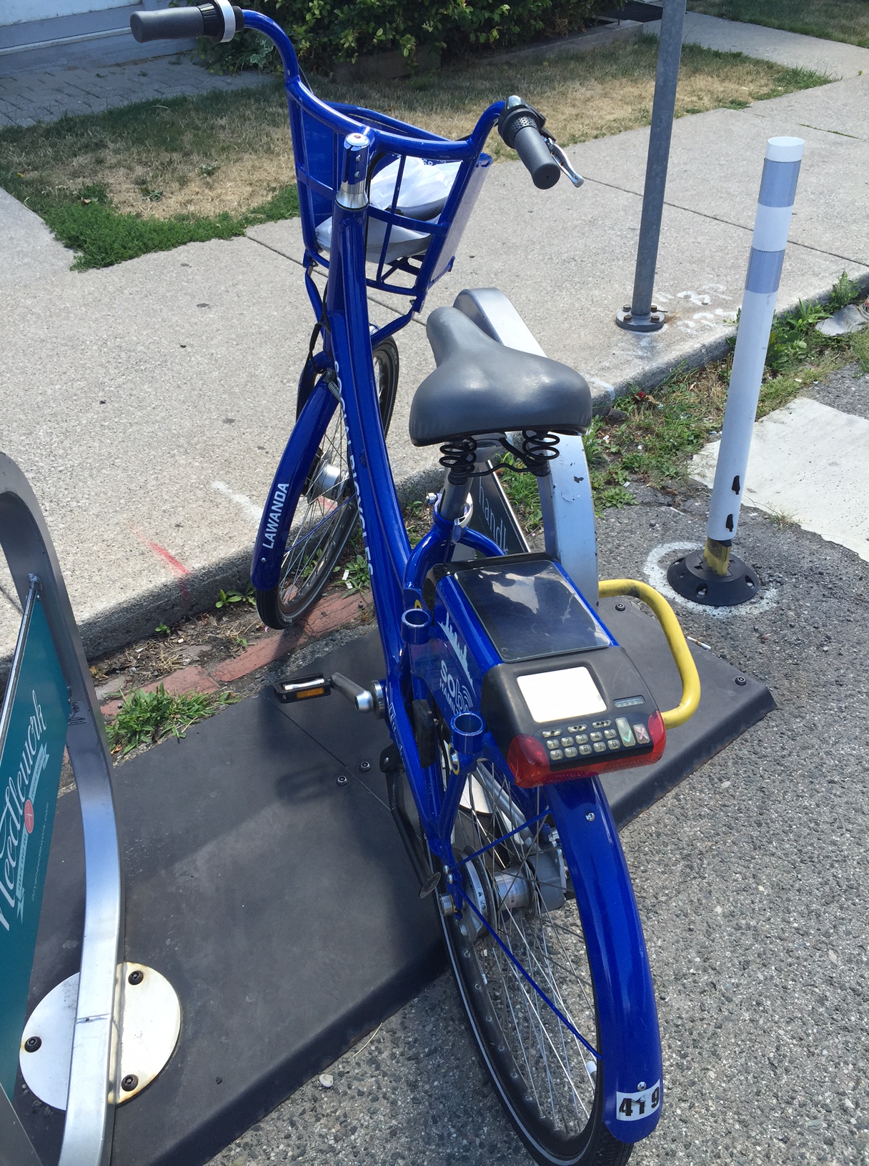
#419 Lawanda is a personal favourite at the Locke Street hub

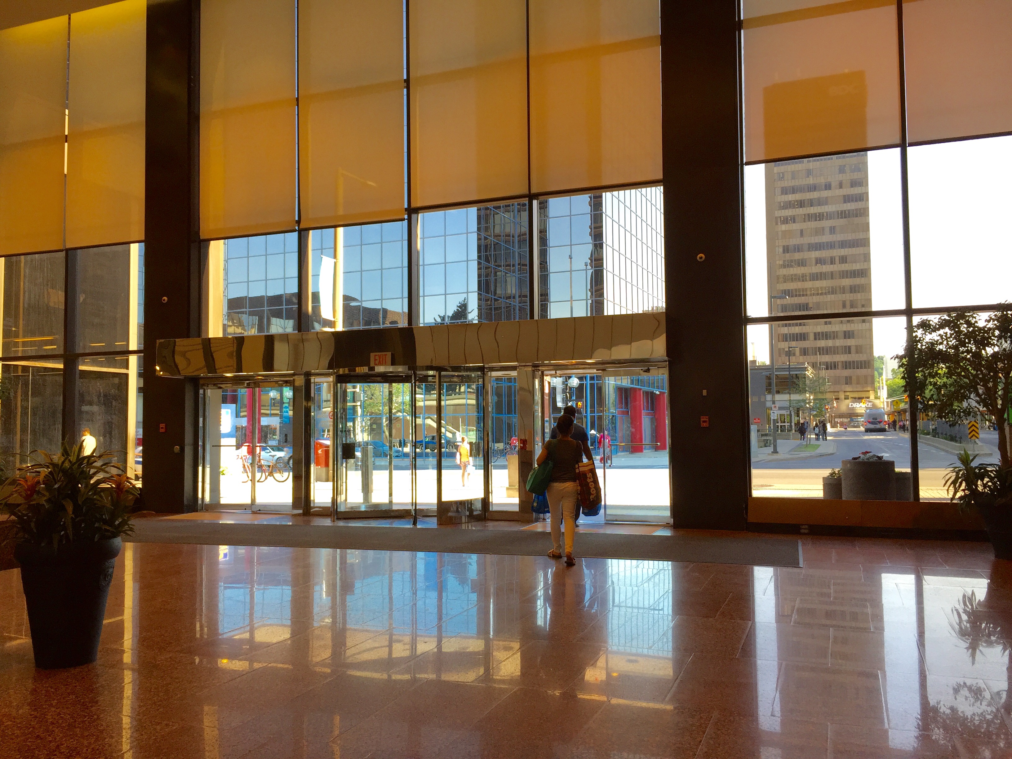
I grabbed a SoBi (there’s a rack conveniently close to my apartment) and was on my way to meet Bill out front of his office on James Street North. He had a route in mind, but we basically just winged it, taking alleys, bike lanes, and roads through the city to reach our destinations.

IMG_4085.JPG

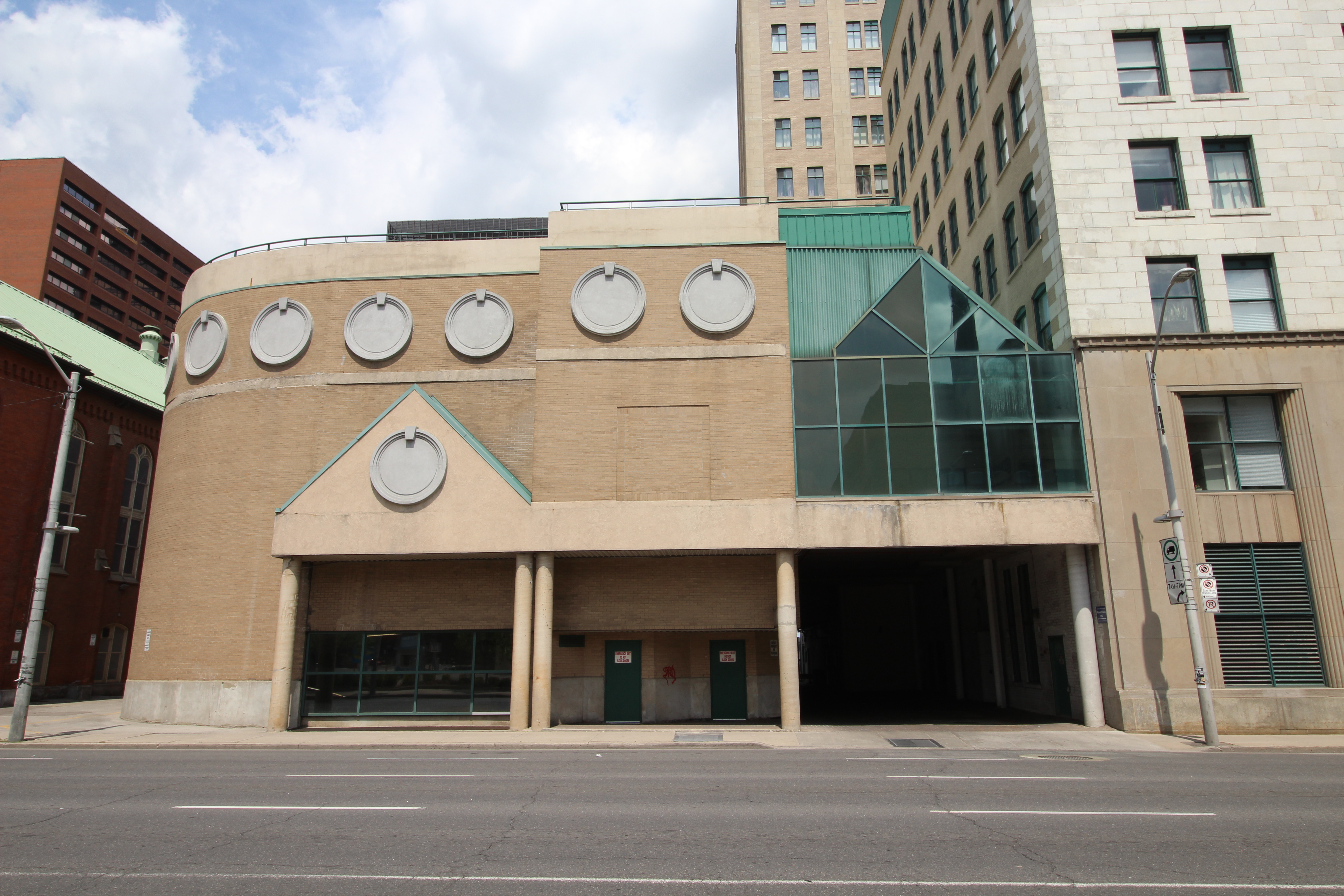
Hidden behind it’s green shell is an old car dealership complete with a car ramp to the second floor

IMG_4086

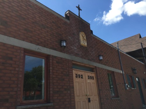
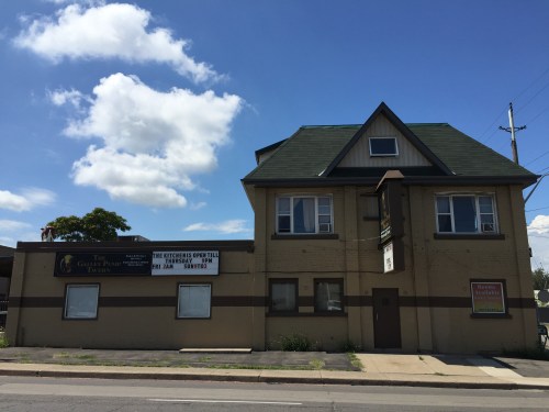
The overlooked Our Lady Of Glastonburty Orthodox Church with little ornament on an expansive street of traffic

IMG_4084

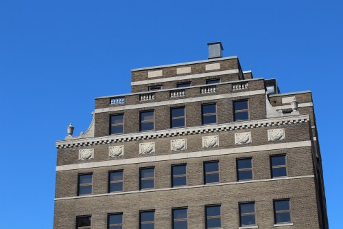
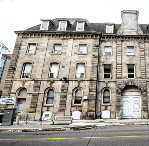
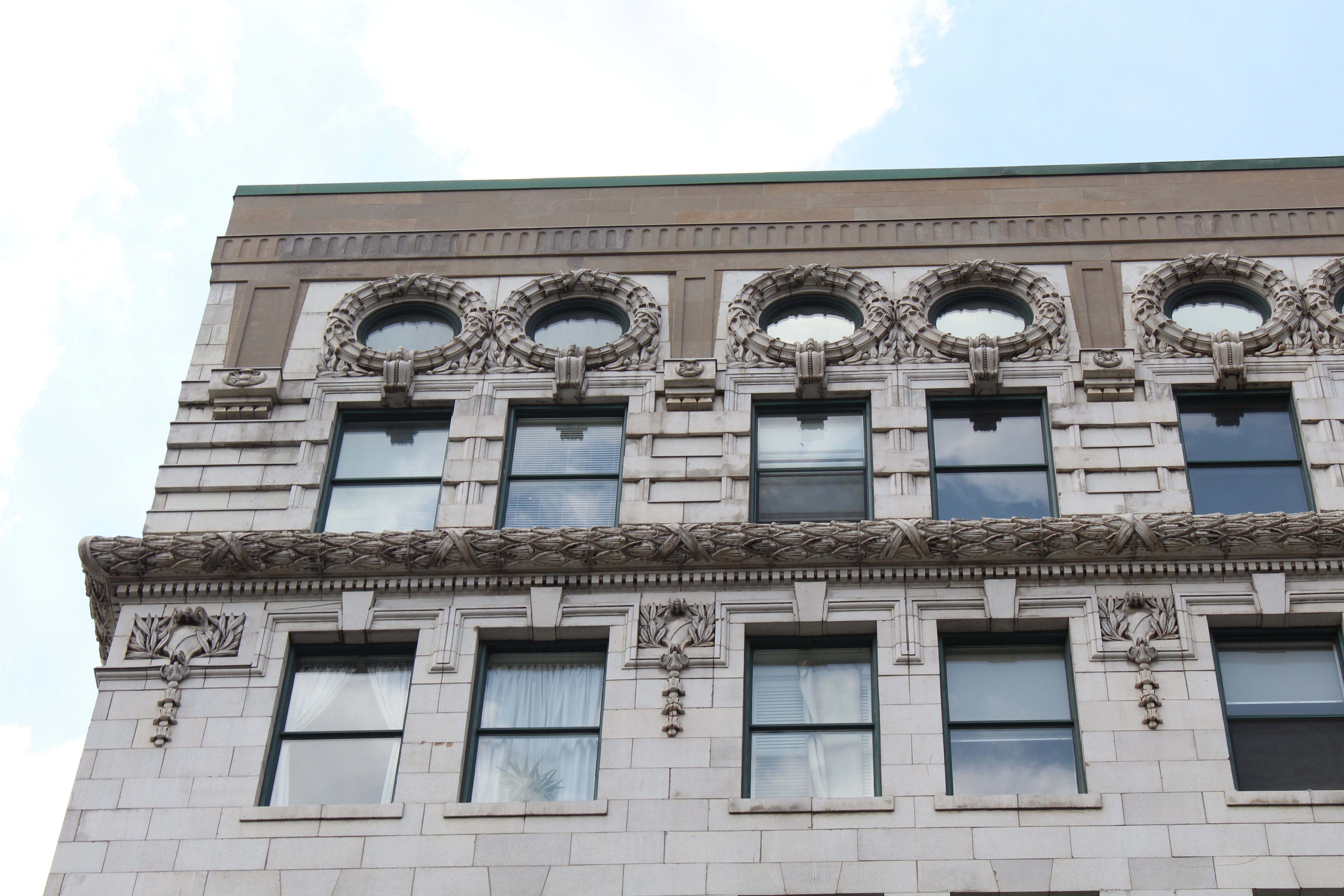
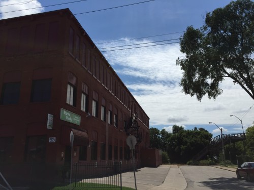
Bill giving me a history lesson about the building that was once Mills Lighthouse

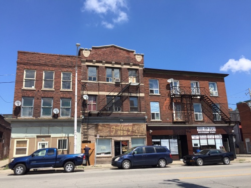
Our first notable stop was the Cannon bike lanes. There we stopped at points to discuss laneway housing, an old car dealership for sale, and a subtle little church easily missed by car.

Laneway housing is something Hamilton needs more of. They add density, character to neighbourhoods, and help increase the city’s building stock in an unobtrusive way (just to name a few of the benefits). Bill’s firm, TCA, did a study on Laneway housing in conjunction with the city and you can read it here.

IMG_4090.JPG

Moving day at a row of apartment buildings just West of Barton and Wenthworth

Next we made our way to Barton. We saw a street on the turn around. Although Barton faces many obstacles, we are seeing pockets of growth and investment sprinkled throughout. Many barriers are still in the way, but there are encouraging signs almost anywhere you look.

IMG_4094

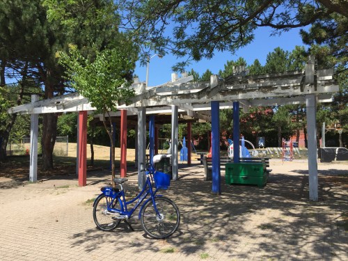
Lawanda in front of a post and beam pavilion at Birge Park

IMG_4095.JPG

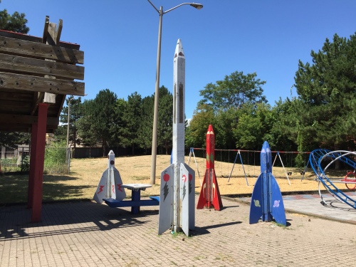
Rocketships of wooden wonder

IMG_4097

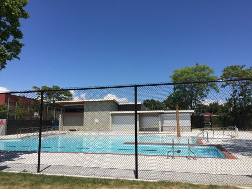
The new pool at Birge Park

We cut through some more alleys and streets before reaching Birge Park. This small park just received a makeover, which includes a new wading pool and change room building designed by Kathryn Vogel Architects. The building has a contemporary feel to it with its overhanging rooflines and stucco accents, while the pool is nothing short of functional as well as aesthetically pleasing.

IMG_4103.JPG

Karma Candy Factory

IMG_4106.JPG

The Galley Pump Tavern. A local favourite.

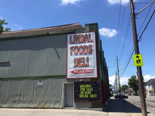
Continuing north, we passed Karma Candy factory, the Emerald Street Footbridge, some local watering holes, and numerous other businesses sprinkled throughout the area. The history in the North End is deep. There’s so much to discover that you can’t find it all in one bike ride. It would take many. I was curious about everything and I couldn’t keep track of it all.

Then came Burlington Street. It’s a different world. Trucks zooming by. Potholes like craters on the moon. We had to weave through areas like a downhill slalom just to get to our destinations.

IMG_4109.JPG

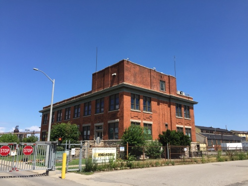
A handsomely detailed early modern office building that once housed Stelco offices.

IMG_4107.JPG

IMG_4110

POV from Lawanda’s perspective

IMG_4108.JPG

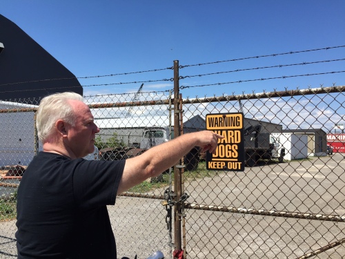
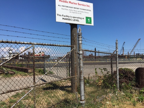
Bill discussing the port lands

We stopped by a handsome old Stelco office and made our way down closer to some of the ports. I wanted to ask Bill what his opinion is regarding the future of our Waterfront since it’s a hot topic in this city. He had differing opinions on what Pier 7 and 8 should look like and that more port lands should be accessible like they once were. After 9/11 security concerns changed that, he said, and the ports became impossible to access. I forgot what the world before 9/11 looked like.

IMG_4112.JPG

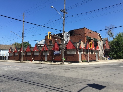
The former, recently charred Hamilton Hells Angels clubhouse (and before that the Gage Tavern) at Gage and Beach.

Before we knew it we were at Gage and we decided to cut south. We passed the recently closed Hells Angels HQ and made our way past more industrial buildings scattered amongst housing on Beach road. One thing I noticed was the many simple, functional, modern buildings sowed about the area. We need to do more to reuse these diamonds in the rough, as many now sit completely or partially vacant.
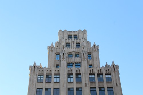
IMG_4113.JPG

Hamilton Moderne

IMG_4115.JPG

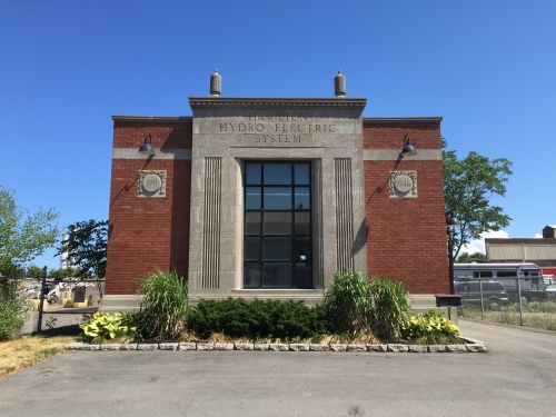
A beautiful Hydro Electric Station turned office building on Sherman with classical features, detailed reliefs, and ornament

IMG_4120.JPG

IMG_4122.JPG

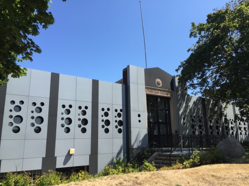
A swiss cheese makeover at Victoria Ave

IMG_4124.JPG

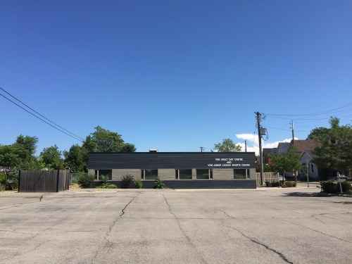
The Repite Centre, refaced by Greg Sather in 2005.

Next was Sherman. We rode past Cotton Factory and discussed its impact, the history, architecture, and the work ecosystem inside it. We also passed some charming early modern buildings on Sherman. I was too busy keeping my eyes on the road to take too many photos, but I certainly want to go back and look at more of what we saw that day.

The tour kept going. It was a long day. 21 kilometers were travelled. Lots of liquids were consumed. I won’t keep you much longer, because pretty soon this article is going to be as tiring as our bike ride. We explored a lot of the city and much of it is hard to retrace.

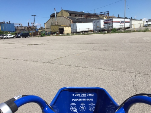
You know what was one of the best things about the ride? Taking a SoBi bike. If you haven’t yet tried one, you should. They are convenient, easy to use, and offer a better way to travel about the city. Those little blue machines are one of the best investments this city ever made. Don’t believe me? Sign up and let me know what you think. I promise you won’t be let down. And you’ll probably become hooked (like me). I barely even drive my car anymore.

Advertisement

1 Comment

Filed under Economy, History

Coffee Talk: Erika MacKay of Niche For Design

Screen shot 2016-05-26 at 5.22.35 PM.png

I first met Erika MacKay at CoMotion 302 (then Platform 302) just over a year ago. Knowledgeable and well spoken, our brief conversation ended up being not-so brief. It lasted well over an hour. Erika’s company Niche For Design is unlike most interior design firms and I can’t quite put my finger on why. She’s been involved in so many projects throughout the city and beyond (checkout their portfolio) and I wanted to ask her about Niche. I wanted to know more. She’s a trendsetter, an amazing interior designer, and a pleasure to have coffee with. Niche For Design has a bright future ahead. Here’s what she had to say:

What got you into design?

I’ve always been into design. Ever since I was a kid I was drawing floor plans. Eventually I learned about interior design and realized that was the area I was most interested in. I ended up doing a degree in Interior Design at Algonquin College. It’s an industry where you always have to be learning and evolving as a designer and that’s something I’ve always loved.

IMG_4218.jpg

Tell me about your company, Niche for design.

I had worked for an architectural firm, for the government, a residential designer and a hotel designer, so I had a really broad range of skills. I really knew what kind of firm I wanted to work in and I felt there were ways to make the process better and more efficient. I wanted to offer services that some other firms weren’t really offering, so that’s when I decided to start Niche and that was in 2012. It was really small. It was just me. And now we are three people, plus lots of trades, contractors, and suppliers on a regular basis.

Piranha-Studios-Comotion-2.jpg

Piranha-Studios-Comotion-13.jpg

What are some of your favourite projects so far?

All of our projects are so different and that’s why I love all of them. The coworking spaces that we worked on were definitely favourites, because they were close to our hearts, since coworking at Platform 302 helped us develop as a company. CoMotion and The Forge were definitely favourites. They were kind of cool. The last year we’ve been doing a lot of office projects. It’s really fascinating to get to know a company and their brand and tailoring the space to their needs as a business.

How do you get to know these companies?

We do a lot of research on their brand and how they want to be viewed. We interview them and go over the details of their space. We also do surveys with their staff too. Often we’ll survey all of the staff members to find out what they need functionally and to get additional ideas from them. For a company to have a space that is actually reflective of their branding and identity is a huge asset. It reinforces the culture they’re trying to build with their staff and it’s a great display for clients when they visit.

What’s the day-to-day life as an Interior Designer?

The programming and launch phases are big day-to-day projects, but they’re enjoyable. There are lots of spreadsheets for organizing the information of our clients. A big part of our time is construction drawings for our clients and ordering furniture. There’s always little glitches that come up, so problem solving and collaboration often happens day-to-day. It’s less glamorous, but I still enjoy it.

What are some of your influences in the design world?

Travel is a big influence for me. I love to observe new cultures and how they use space differently and  I love to learn about their traditional aesthetic. I like to see what’s trending in different areas too. We live in a globalized world, but there are always subtle differences in trends between cultures. It’s also important to pay attention to fashion. They’re pretty closely related. But I’d much rather shop for a sofa than clothing.

Dining-Feature-1.jpg

Bedroom1.jpg

What are some upcoming trends you see?

This neutral palate seems to be holding strong, but I’m seeing clients become bolder with their colours and patterns. Pattern tile is a really big trend that is coming through. So far it’s been neutral too, but we’re starting to see colour there. A lot more clients are looking at durable materials and wanting a better longevity in their products. They’re looking from a sustainable perspective and wanting things that last. Clients are becoming more environmentally conscious about their furniture choses.

What do you bring to the table that sets your apart from others?

I think having the team that I have in place is very important. They all have different skill sets and together we’re really strong. We try to be a lot more flexible. The tradition design process is really rigid, and it isn’t perfect. There has to be a better way, so we try and make the process smoother and easier for everyone. We are open to how the process could work.

Where do you see your firm in 5 years time?

I think we’ll probably have a showroom space. There will be some growth in the works. We’re already growing right now. I’d love to expand the team a bit more and focus on bigger projects that we are trying to obtain. We also want a warehouse space for faster distribution. There’s a lot of improvements that could happen within the process.

What is your favourite thing about Hamilton?

The people are very different. They’re very collaborative, open, and supportive. The architecture is amazing too. So many cool buildings in this city that are waiting for more creative uses. And the food scene in Hamilton is ridiculous. So amazing. There are so many great, unique independent restaurants throughout Hamilton. I don’t think I’ve been to a city where the food scene is like ours. There’s almost no chain restaurants downtown.


Leave a comment

Filed under Coversations over coffee

20 buildings that make Hamilton so great

1) Yeah, I’d say the Lister Block is pretty damn awesome. The white terracotta and brown brick make it look like an edible piece of cake.

IMG_2990.JPG

2) The Medical Arts building is a work of art. How awesome are those urns?

IMG_0015

3) Stanley Roscoe’s City Hall. A building too beautiful for bureaucracy.

Screen shot 2016-05-06 at 3.30.53 PM

4) The brutalist Hamilton Place. A gothic-inspired fortress on the exterior. A visually and acoustically masterful interior.

IMG_0162.JPG

5) Treble Hall: A facade that makes you stop and stare. Also, can you say Wine Bar?

IMG_0247

6) The city’s first and best Skyscraper, the Pigott Building. Anybody want to split on a penthouse?

IMG_2764

7) Stelco Tower might be rusty (thanks to stelcoloy), but it is still one badass building.

IMG_3026.JPG

8) It might be a copycat. Honestly though, who cares? The Landed Banking and Loan Company Building is one special piece of architecture.

IMG_2783

9) The Right House is more than just alright. It’s allllll right (bad joke).

IMG_0568.JPG

10) The Hamilton Public Library Central Branch and The Farmers Market. Books and Food. Concrete and glass. Nuff said.

IMG_3040

11) We have a freaking castle. (Dundurn Castle)

IMG_9969.JPG

12) A FREAKING CASTLE.

IMG_9971.JPG

13) OH HEY LOOK IT’S ANOTHER CASTLE. (Scottish Rite)

Screen shot 2016-05-06 at 3.37.34 PM.png

14) We all have a love/hate for the city’s tallest building, 100 Main.

Screen shot 2016-05-06 at 3.34.37 PM.png

15) All white Victoria Hall. A facade that makes you happy.

VICT.png

16) The Royal Connaught. A lobby suitable for Royalty. We won’t talk about the rest of the development though.

Screen shot 2016-05-06 at 3.33.21 PM.png

17) Can we please get this building designated? (The Coppley Building)

Screen shot 2016-05-06 at 3.35.41 PM.png

18) The TH&B Go Station: An Art Dec(G)o beauty.

IMG_0026.JPG

19) Liuna Station is perfect. Look at the garden. Look at those columns. The curtains inside the halls? Versace.

IMG_0295.JPG

20) Let’s just admire this for a second. (Cathedral Basilica of Christ the King)

Screen shot 2016-05-06 at 4.43.03 PM.png

6 Comments

Filed under Architecture, Entertainment, Uncategorized

Coffee Talk: Hamilton Holmes

F1000013

I first met Nicholas Hamilton Holmes for coffee at Mulberry just over a month ago. I was introduced to Nicholas’ work through Bill Curran, after he allowed Nicholas to use his office space for a photo shoot. At only 32, Nicholas is way ahead of his years, both in intelligence and skill.

He’s always carrying around a sketchpad and is full of conversation where brief meetings turn into hour-long discussions. He’s a trained cabinetmaker, furniture maker, and furniture designer. His wife is an incredibly talented interior designer, which makes them the perfect couple. Inspiration is always abound.

I walked into Café Oranje to meet Nicholas for a coffee and was greeted with his bearded smile. Sitting there with his sketchpad open, we started our interview after rambling about every subject we could conjure up. Hamilton has only seen the tip of the iceberg when it comes to Nicholas’ talent, but as you’ll see in the interview below, the sky is the limit.

When did you first get into this trade?
I started in 2008 at a technical college in Montreal. It wasn’t even a design college or anything; it was part of a Quebec program to encourage trades. It took a year and half and because it was a Quebec program they got into a lot of traditional stuff, like carving, veneering, bending wood, and finishing.

What made you get into design?
I loved to make things as a kid. I was always trying to make clothes and other random stuff in my parent’s garage. I was making leather stuff at the time that I found this wood program and I always loved woodworking in high school. I was all about shop class and I did really well in it and then my parents kind of steered me to university. Then the program popped up and I went for it. I was working in a bar at the time and I didn’t have any plans of where my life was going, so I thought this would be good. And it was better than good, it was always what I wanted and I didn’t know it at the time.

backleft EDFRont View ED

And where did you go from there?
I did a work experience program at a high-end custom shop in Montreal and it really deepened my passion because it was so high quality. They did a lot of exchange programs with Parisian furniture makers that came from really nice ateliers, so I was amongst those guys too. Just to watch their work and see their quality of tools and their passion for it, it gave me even more inspiration.

upviewedit

When I look at some of your furniture it has that midcentury modern touch to it. Where did that influence come from?
I think its part of me. I’ve always loved geometry. Whenever I painted or drew or designed, I always started with geometry. It seemed like a logical step to me. Because I always did things by hand, I didn’t start my design process on the computer. I started with a ruler, compass, and paper. And that lends to modern styling. I think the minimalism you’re referring to comes with the need to produce things at a good cost, which doesn’t always work out that way. Basically from an economic point of view, the more simple and streamline your designs are, the easier they are to produce. It’s not always the case, but its kind of a perspective. I can’t say for sure, because I’ll have simple designs that are still expensive to make. That’s my ultimate goal: to make something that’s well balanced with proportions and geometry, but as also minimal as possible.

So what do you clients look for?
Most of my commissions are pretty open. They have a lot of trust in me. I’ve been lucky. Sometimes they’ll have inspirations, but the general client that wants something, even if they’re really interested in furniture, don’t really know much about it. The design choices are always up to me. If someone wants me to produce something exactly as it is shown, I’d probably say no because it doesn’t leave any room for expression.

Where do you want to be 10 years from now?
I want to design furniture for production. Something like a small batch production, producing maybe 10 pieces at a time. I hope to see myself in a shop with a few assistants, or apprentices, or cabinetmakers, working with me producing limited batches of really high quality stuff that’s produced in a way that isn’t too much. I think it would nice to make something that is still expensive, but not too expensive – something that someone has to save for, but can see him or herself owning.

IMG_6184IMG_6177

How’s the furniture market been in Hamilton?
Hamilton has a lot of wealthy people in it, for sure. There are a lot of wealthy families out there. I’m trying to service my peers as well. I want the price point to be manageable. The frames I’ve made [which are for sale at Earls Court Gallery] have been a success. I’m hoping that will keep going. I want to have people enjoy them in their house.

What drew you back to Hamilton?
All the pieces were in the right spot. A lot of my friends were moving back to Hamilton, doing their trades and building families. To trump all of that it’s where my friends and family are. Everything came together at one time.

And what do you love about Hamilton?
I love the constant development, the unpretentiousness of the people, the beautiful architecture, which we can all agree on. The opportunity. The energy. It’s got everything going, really. It’s kind of perfect for me. And it’s so close to Toronto too. It’s not like I’m sacrificing a big city market living in a far-flung area. I can make inroads in Toronto on a very casual basis and that’s nice.

Going back to influences, who influenced you in furniture design?
I’m not a big names guy. The major names like (Charles and Ray) Eames or (Hans) Wagner, they’re big influences. Any of the big modernists influenced me a lot. Probably the Art Nouveau is my biggest era of influence. The beautiful thing about Art Nouveau is that it’s a mixture of organic inspiration and geometric minimalism. I’m a big nature lover and hiking in the forest rejuvenates me and inspires me. I’m also inspired by a lot of contemporaries who are creating small batch production throughout North America.

What part of the process do you like the most when it comes to designing and making furniture?
The design process, for sure. It takes so damn long to build everything and a lot of cuts on your hands. It’s tough and really, really hard to get through sometimes. When I’m sitting in my studio, drinking a coffee and sketching is where I really get my kicks and the most excited. But I think that’s the same for any maker. Sometimes you don’t want to finish and hate some of the process, but when you finally finish you can’t believe you created that piece of furniture. There’s still a big romance with the whole process. I love the smell of wood and working in a shop.

IMG_6054IMG_6049IMG_5943

What is your favourite piece of furniture that you’ve designed, so far?
My latest piece, the Danish cord bench. It was one of the hardest things to build, technically. There were a lot of challenges to it. I had to troubleshoot a whole host of problems. It took me almost a year to build three of them. I love all my projects though, really. The frames are now a real product, which is nice. I love that. I’m making a toy box right now with gold leafing that I’m really excited about. But I won’t take too much of the surprise away. Stay tuned to see!

I obviously have to ask you this. What’s your favourite building in Hamilton?
There are so many great buildings. I love the Carnegie Gallery in Dundas, there’s a romance there for me because I feel like it’s always been there for me. The beautiful butterfly that is City Hall is also one of my favourites. I love the Tudors in Durand too. If I had to pick one, I probably couldn’t.

See more of Nicholas Holmes work at http://www.hamiltonholmes.com/

Leave a comment

Filed under Coversations over coffee

Architectural Spotlight: The Waterdown Library and Flamborough Seniors Recreation Centre

IMG_2754

RDH Architects
163 Dundas St E, Waterdown
Completed: January 2016

Designed by RDH Architects the 23,500 square foot building is more than just a library. It also houses the city’s municipal service centre, a senior centre, Flamborough information and city services, and the Flamborough archives.

The 15,000 square foot library has better accessibility, more computers, outdoor reading areas, and even dedicated quiet spaces, to name a few of the upgrades. A huge step-up from the town’s last library, which occupied the old East Flamborough Town Hall and had limited space to meet the current standards of today’s libraries. It was too small, hidden, and dated for a town with an ever-expanding population.

IMG_2735

Topography played a pivotal roll in the design and programming of the new building. Situated on a sloping site, the building splits levels while managing to stay a single storey, in keeping with the character of the community it surrounds. The grade is used to create identifiable spaces through a sloping corridor, acting as the buildings axis. The spaces are also organized through levels, creating an easier navigation of site and accessibility for all ages.

IMG_2671

Inside the library, the children’s section includes unique furniture, and a playful asymmetrical skylight. Surrounded by glass exterior walls, it provides transparency for parents and an engaging environment for the children.

IMG_2732

IMG_2698

IMG_2704

Stairs and ramps lead you through the tiers of categorized book stacks. Skylights bounce off the punched ceilings, pouring natural light throughout the interior. And quiet studies encased in glass offer solitude from the surroundings, while still keeping the user connected to the space through visibility.

IMG_2681

IMG_2687

At the top tier of the library the glass glazing overlooks Dundas Street, scattering southern light amongst casual seating, a communal table, and computer desks. The use of natural and artificial light is impressionable.

The material palette inside the library is simple: wood (some of it repurposed), polished concrete floors, gypsum board, steel, and glass. Rich but subdued, a recipe for a warm and welcoming interior.

IMG_2762

Outside, the glass curtain walls on the north and south sides of the building interact well with the street and the neighbourhood it surrounds. The use of the sites grade and the division of space is apparent at the south end of the building. You can see the levels split, divided by a grassy knoll and stairs with a glass balustrade. Limestone panels clad the west side of the building, meeting the southern façade with a geometrical cantilever, creating a significant punch to the overall composition.

At first glance the location seems wrong. It’s located on Dundas Street, the town’s busiest arterial road, close to big box stores and highways. But that’s exactly the point. Waterdown is sprawling and relocating it to another downtown side street doesn’t make sense. Parking is scarce and accessibility becomes an issue. The site it resides on engages onlookers with its presence and the northern entrance is also connected to the approximate neighbourhoods through the use sidewalks and bicycle parking racks. It’s a new hub for a town with ever-expanding subdivisions. Modern orthodox planning reigns supreme.

The new Waterdown Public Library and Flamborough Seniors Recreation Centre has already won a Canadian Architect National Award of Excellence and it’s easy to see why. This project is one of the best pieces of architecture the city of Hamilton has seen in years.

1 Comment

Filed under Architecture

Architectural Spotlight: Stelco Tower

image4

Stelco Tower
Arthur C.F. Lau
100 King Street W
Completed: 1973

Look up, way up. 338 feet up to be exact. That’s the height of Stelco Tower, currently the second tallest building in Hamilton. A modern tower of 26-storeys designed by Quebec architect Arthur C.F. Lau.

plaza

The building was erected to not only house Stelco’s head office, but also showcase the company’s newest steel, “Stelcoloy,” a special steel alloy that was meant to rust slower and protect the steel from future damage. Now a rusty brown through years of oxidation, the steel was a blue-grey when the building was completed in 1973. Not as striking as the patina of copper, but the material still has charm.

image7

The design is minimalist, almost Miesian, an International Style tower with local flair. However, it doesn’t have the prominent vertical flanged mullions of a Mies van der Rohe skyscraper. Instead the tower emphasizes height through a repetitive grid of horizontal bands of glass and Stelcoloy. The volume of the building draws your eyes up.

image3

image1

image2

At 100 King Street, the three-storey entrance is austere. Inside the lobby it’s strictly business, with an elevator core clad in stainless steel, red granite floors, and a lonesome security desk. Jackson Square Mall is connected to the tower on the north side and it can also be accessed via the malls plaza roof. Occupancy is low since Stelco moved out completely in 2004, leaving many stories vacant.

north

East

Currently the 21st floor is an empty space available for events, offering breathtaking views of the city.

The tower was part of Hamilton’s first urban revitalization project that plagued the city with modern, auto-centric planning as early as 1958 and included the construction of Jackson Square starting in 1968.

Don’t be fooled by the rusty façade, better days are yet to come for Stelco Tower.

Leave a comment

Filed under Architecture

PHOTO OF THE DAY – June 1st

HighlandSecondary

Highland Secondary School (Architect: Stanley Roscoe) – Dundas

Leave a comment

June 1, 2015 · 9:40 pm

Architectural Spotlight: The Federal Life Assurance Company Building

IMG_0146 Federal Life Assurance Company Building
Finley and Spence 40
James Street South
Completed: 1906

The Federal Life Assurance Company building sits amongst some of the Hamilton’s most cherished buildings, yet it’s history has been overlooked. Completed in 1906 and designed by Montreal-based architects Samuel A. Finley and David J. Spence of Finley and Spence, this Beaux-Arts building is composed of neo-classical elements and designed in the Commercial Style. A style made popular by Louis Sullivan and the Chicago School of Architecture.

At 9-storeys the Federal Assurance Company building is just shy of being Hamilton’s first steel framed skyscraper (one storey short of the 10-storey minimum). It was constructed with steel and reinforced concrete, supporting the glazed terracotta façade. The commercial style was breakthrough for the time. Its massing and height were an evolution from its heavier wood and stone predecessors. A popular theory about the commercial style is the building symbolizes a classical column, divided in three sections. IMG_0155 The first section, the base of the building, is less decorative. Composed of reinforced concrete, with tall windows, spandrels, and detailed window reveals, but little else. Middle White glazed terracotta and double-hung windows make up the middle of the building, or the shaft of the column. The vertical gaps between every second window emphasize the buildings height and draw the eyes up. Before the top section of the metaphorical column there are ornamental crests surrounded by wreaths and windows with a continuous band of decorative lintels. IMG_0157 The top two-stories, or the capital, are separated by a horizontal band of foliage and dentils. More ornamental foliage is added to attract the eye, while the top floor is complimented with porthole windows surrounded by intricate wreaths. On the southern façade the portholes are just reliefs with no glass or ornament, but still add to the decorative effect and keep with the buildings characteristics.

Photo Courtesy: Toronto Public Library

Photo Courtesy: Toronto Public Library

The roof was originally capped with a large projecting cornice, but it has since been removed, leaving the top of the building naked. IMG_0142 Other changes have been made to the building, as well. Some windows have been added and removed from the west side of the building. There is also a two-story post-modern parking garage added to the back of the building from the early 1990s. The addition features simple brickwork, columns, green corrugated steel, tinted glass windows, and more porthole reliefs. Originally built for the Federal Life Assurance Company, the building houses both commercial and residential tenants.

3 Comments

Filed under Architecture

PHOTO OF THE DAY – April 27th

CDOsCDyUMAA_hFy

Main St & James St S – History and Heritage x 3

1 Comment

Filed under Photo Of The Day

PHOTO OF THE DAY – April 21st

IMG_0078

The High Level Bridge, The Bay, and The Beautiful City

Leave a comment

Filed under Photo Of The Day