Tag Archives: Lintack Architects

The Curious Case of The Hamilton City Centre

IMG_2522.JPG

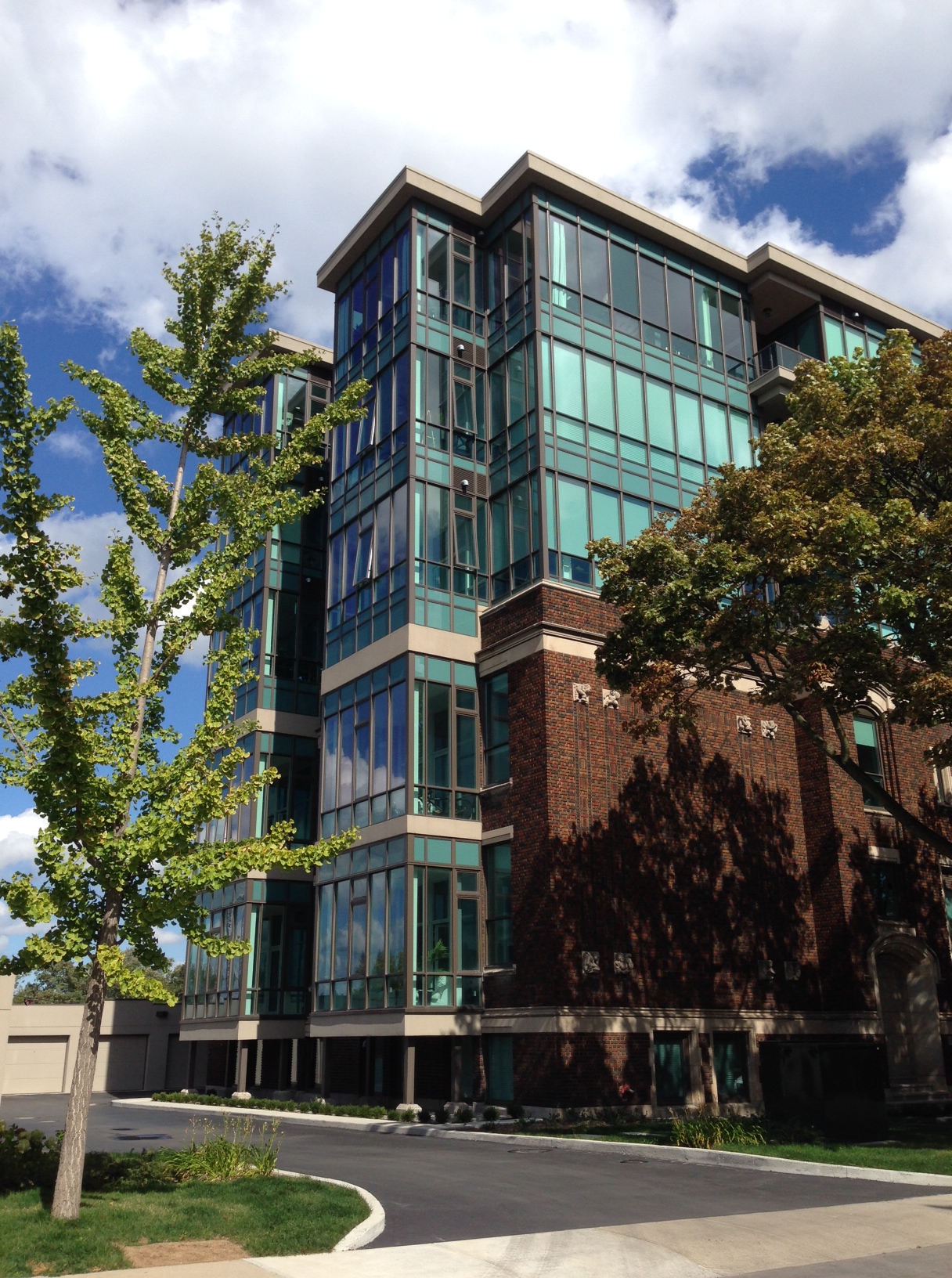
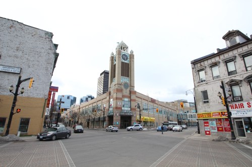
The City Centre, formally the Eaton Centre, is an eye sore. There is no subtle way to put it. It’s ugly, it’s imposing and for such a young building, it’s aged terribly. However, there’s more to this postmodern monstrosity than what meets the eye. It’s become a part of the James Street North fabric and is worth examining more critically.

Completed in 1990 by Baltimore firm RTKL Architects, it was designed during a time when postmodernism was avant-garde in Canada. Mississauga’s City Hall was completed a mere three years earlier by architects Jones and Kirkland and for the most part, was a resounding success in a booming city. But one of the issues with postmodern architecture is it becomes dated. Quickly.

Though what’s interesting about architecture is how style is cyclical. What was once in style becomes out of style, only to be back in style again. Postmodernism has a charming braveness to it. It’s daring, confusing, whimsical, unique, and sometimes terribly executed (sorry, Michael Graves). Most buildings designed during this era of architecture look like they’ve had an identity crisis. Is it modern? Is it contemporary? Is it classical? The City Centre is no different. What is it?

IMG_2511

Reticles of steel tracery surround the James St N entrance, an unintentional metaphor for how it missed the mark.

The exterior is more like a barracks than a mall and could be mistaken for the James Street North Armories. It’s a fortress, with almost no windows, unwelcoming entrances, and kitsch accents. The brickwork, tacky but fun; the steel framing, odd; the pastel colours, dated; and the clock tower is one of its only applaudable statements. Overall, the exterior could do with some re-imagining.

IMG_2534

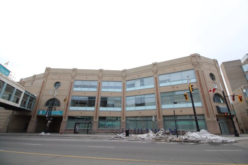
New glazing added to the York Boulevard facade

In 2008 Lintack Architects did some exterior and interior work, adding windows and offices along the York Boulevard streetwall. A continuation should be made to James Street North. More windows, entrances that reach further to the street, and a greater connectivity to storefronts at street level could help revitalize its appearance. There is no interplay between the City Centre and any of its neighbours. Finding ways to mirror the success of pedestrian friendly buildings is a step in the right direction.

IMG_2517

The inside of the City Centre is a different story. It’s a lovely example of postmodern design done right. With nods to an architectural past (the interior was inspired by the Galleria Vittorio Emanuele II), the space is light, airy, and is a welcomed change compared to the abysmal, low-ceilinged bunker that is its neighbour, Jackson Square.

IMG_2513

Skylights pour natural light into the space through rows of arches. Detailed columns line the balustrades on multiple levels, framing the space in a gentle manner. While the food court is below grade in an atrium setting, topped with a glass dome surrounded by a frieze titled “Lineage” by artists Susan Schelle and Mark Gomes. The interior brings back nostalgic feelings to many Hamiltonians and it ought to be preserved accordingly.

This is where the fear of change lies. The interior doesn’t need much. What it needs is refurbishing. The incandescent bulbs are burnt out like an old amusement ride, paint is peeling and fading into unrecognizable colours, and the space is sorely missing tenants.

Drawing tenants should be the main concern, which will come. After all, this playful space once housed Eaton’s. World Gym is soon to move in, which should bring a great amount of foot traffic and hopefully snowball into something more.

The food court needs food, the spaces require tenants, and the tiled floors need treads walking all over them. As Jackson Square slowly claws its way back to a viable shopping destination, so too will City Centre. All it needs is some love and attention.

Let’s just hope Cash 4 Money leaves the premises, because the City Centre is better than that. Nothing deters people like a shark in the water.


Advertisement

5 Comments

Filed under Architecture

PHOTO OF THE DAY – November 2nd

IMG_0145

The Empire Times – 41 King William St. E

Leave a comment

November 2, 2014 · 11:10 am

Architectural Spotlight: Witton Lofts

image-17Witton Lofts
Lintack Architects
Core Urban Inc. Development
50 Murray St
Completed: 2013

Due to demographic shifts, seemingly poor management, budget constraints, and multiple other circumstances, the Hamilton-Wentworth District School Board is facing school closures throughout the city. Witton Lofts, formerly McIlwraight Public School, is a intelligent example of how you can adaptively re-use a former school without a wrecking ball.

Completed in 2013, the five-storey, 36-unit loft is a catalyst for redevelopment in the core. The design of the building effectively incorporates and preserves the two-storey school from 1925, while a three-storey emerald jewel box of glass and steel is superimposed on top of the neo-Romanesque building. The outcome is a harmonious marriage of contemporary and classical architecture. image-18 New entrances have been relocated to the east side of the building, where an elevator has been added for accessibility to the upper floors. image-20 Two additional entrances are also located at the rear of the building under original arched doorways. image-21 The schools façade has largely remained unchanged with its detailed limestone ornament and intricate, colourful brickwork. The only changes being cosmetic and structural upgrades, such as pot lights and new windows.

With a mixture of both fully enclosed and open-air balconies, the lofts offer panoramic vistas of both the bay and James Street North. image-22 Parking garages for residents have also been added for additional parking and storage.

Architect William Palmer Witton designed McIlwraight Public School while he was partnered with Walter Wilson Stewart. During his formative years, Witton apprenticed under Alder & Sullivan (two of America’s most influential architects) in Chicago between 1893 and 1894, where he was trained in the Beaux Arts tradition. His other notable Hamilton landmarks include Herkimer Apartments, George R. Allan Public School, and a chancel addition to Christ Church Anglican Cathedral, to name a few.

In 2013, Witton Lofts received the City of Hamilton Urban Design Award of Excellence for Adaptive Reuse.

4 Comments

Filed under Architecture

Architectural Spotlight: Atrium@MIP

image_1

Atrium@MIP (formerly Westinghouse West Plant)
William P. Souter and Associates/Lintack Architects
175 Longwood Road South
Completed: 1950/2009

Kickstarting the renovation projects on Longwood Road South, the premier multi-tenant building at McMaster’s Innovation Park was The Atrium@MIP. Updated in 2009 at a cost of $17 million, it continues to be a strong model of adaptive reuse for the many vacant industrial buildings throughout West Hamilton and beyond.

Formerly the Westinghouse (and later Camco) West Plant office building, it was completed in 1950 as a classic example of modern industrial architecture. Although it has been described as International Style architecture, this should be considered conceptually as a blanket term, rather than an example of a particular style. Designed by William P. Souter and Associates, the building shares similarities with Frank Lloyd Wright’s Larkin Administration Building and Albert Kahn’s Burroughs Adding Machine Plant.

imageinterior

The floor plans of The Atrium@MIP interior shadow the classic Larkin Administration Building – in particular, extensive spatial unity and natural light. The newly renovated framework closely resembles Wright’s Larkin masterpiece, including an innermost light court providing natural luminosity to all floors of the buildings vertical layout.

image_2 800px-Burroughs_Payment_Systems_Plymouth_Michigan

Though much smaller in scale, the surface of the building shares a similar composition to the Burroughs Adding Machine Plant. The red brick façade, stringcourses, tower-like entrance, and symmetrical windows echo the modern influence of the 1930s that inspired Khan in Plymouth.

In 2005, extensive site reclamation of The Atrium@MIP began under the watchful eye of Lintack Architects. Immediately, the mechanical and electrical systems were replaced to increase energy efficiency throughout the entire superstructure. Then, interior partitions were removed to adjust to the new layout, providing better accommodation for a multitude of new offices and the addition of three new elevators.

At the same time, advanced energy efficient and cosmetic upgrades were applied to the exterior of the edifice. Modern insulation, state-of-the-art windows, and an R valve roof coupled with two L-shaped aluminum clad canopies flanking the entrance provide a necessarily contemporary component to the sweeping facelift performed.

Leading the way, the Atrium@MIP was a rewarding project that may provide important lessons to further generations of reuse pending on various uninhabited yet promising sites in Hamilton. These idle but auspicious locations represent the spirit of Hamilton, centralized in an ambitious city and the history it carries forward.

1 Comment

Filed under Architecture